Illustration System Work
Illustration has always been a passion of mine. I believe that when used sparingly, illustration has the ability to add clarity and personality to otherwise very corporate-looking products. The projects below are the result of proposals that I wrote and pitched myself in an effort to enhance the products with which I was already working.
Skills: Project management, art direction, illustration

VSL Illustration System: Planning & Ideation
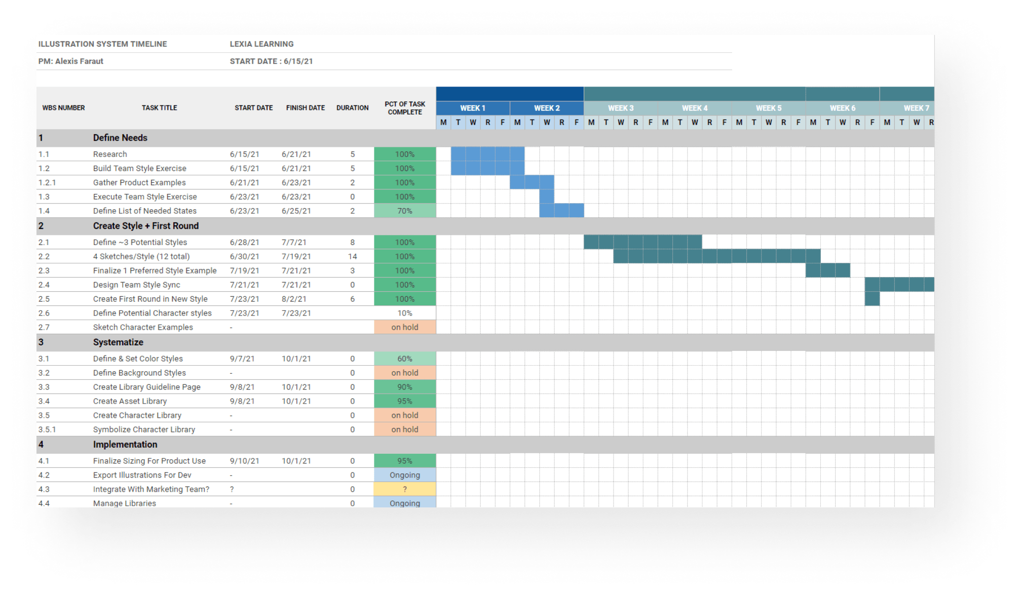
An important step in any project is planning out the project timeline. Shown here is the Gantt chart I made to map out the proposed timeline for this project. I was able to follow and update it throughout the whole process to keep myself on track.
I wanted to make sure I was getting input from my team when concepting the illustrations so that everyone had a say in how our products were being percieved. I set up this virtual workshop via Figjam so that we could all work together to plan out a style.

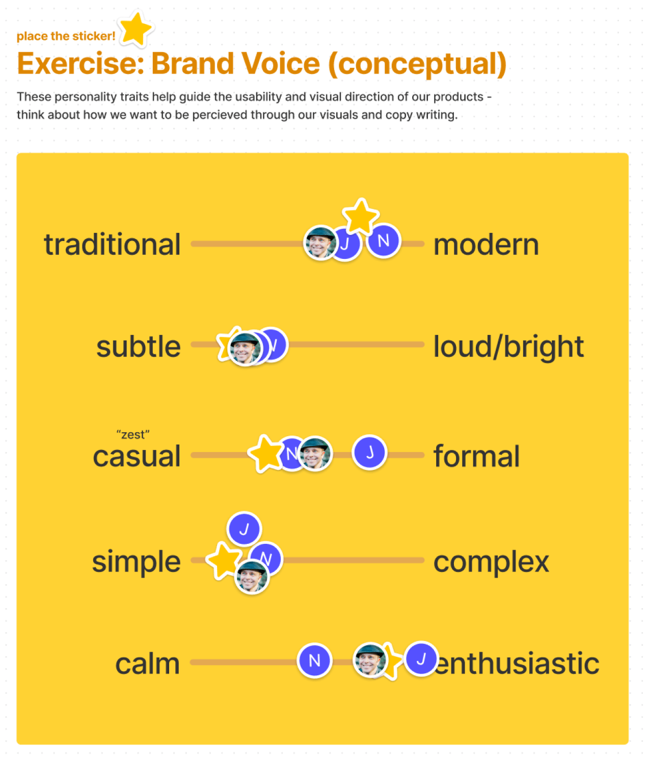
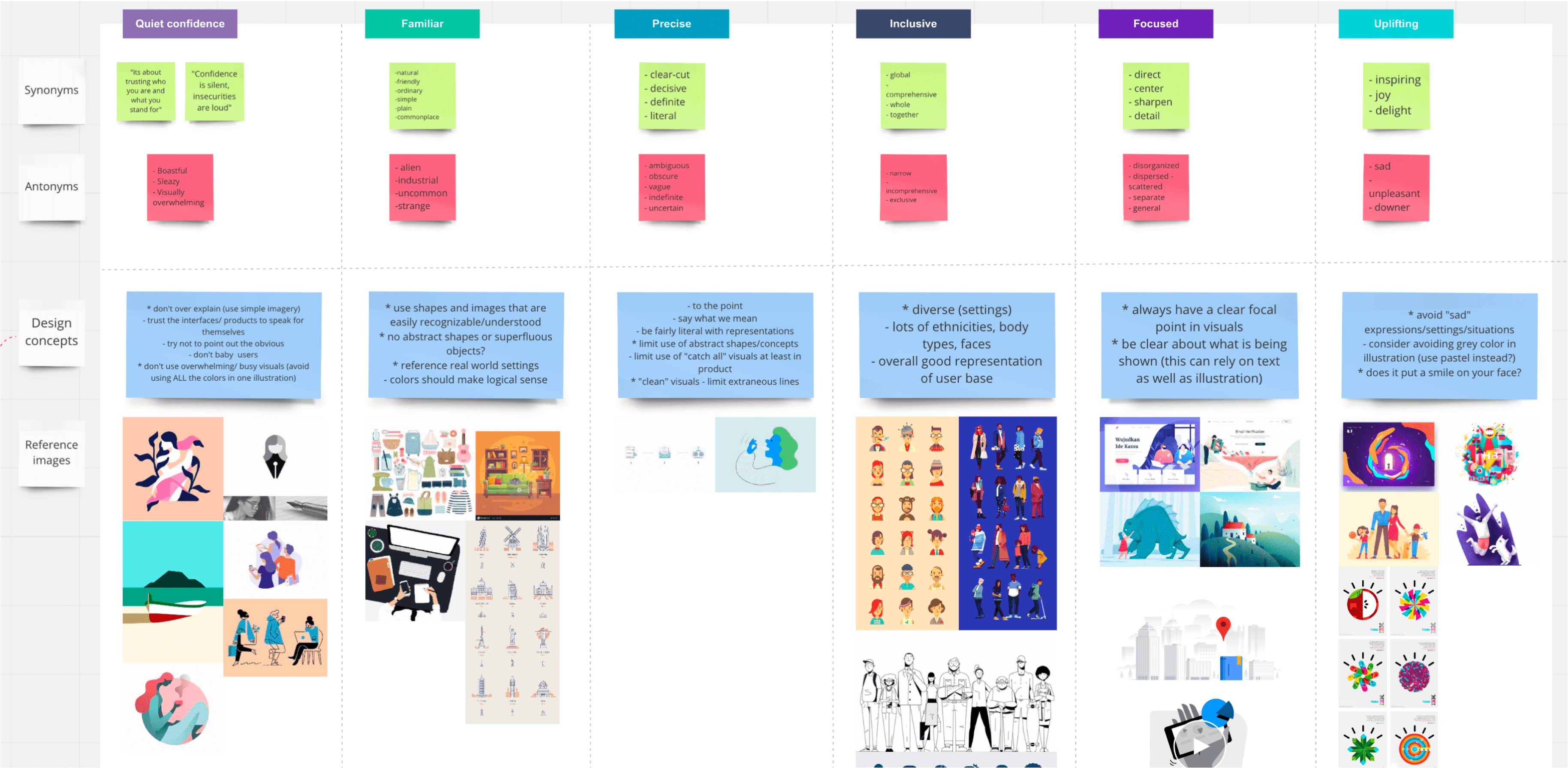
An example of one of the workshop exercises I set up: using common brand keywords, the team placed stickers on a spectrum to define the direction we wanted our illustration system to take.
Sketching & Iterations
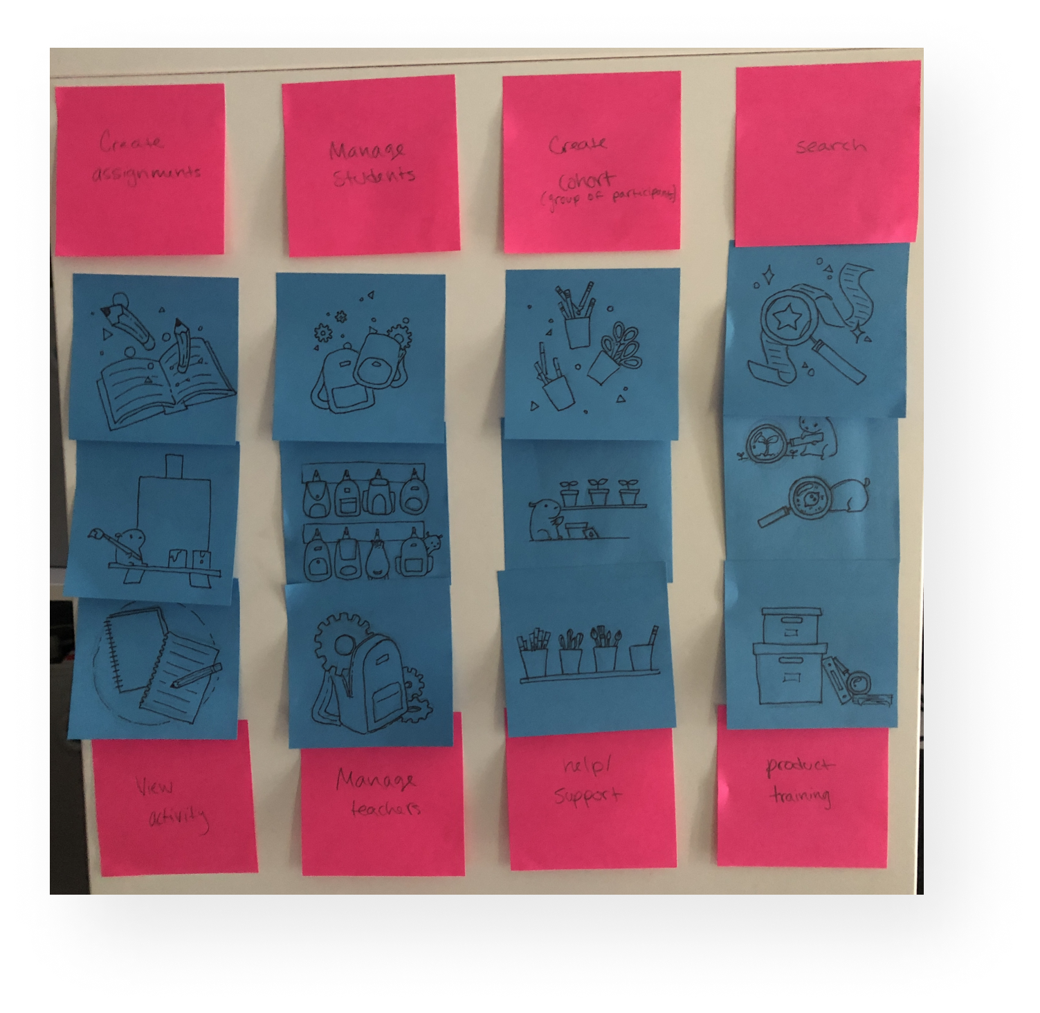
After working with my team to define a direction, I started the sketching process. I used common empty state pages to concept several specific examples that we would later use in our products.
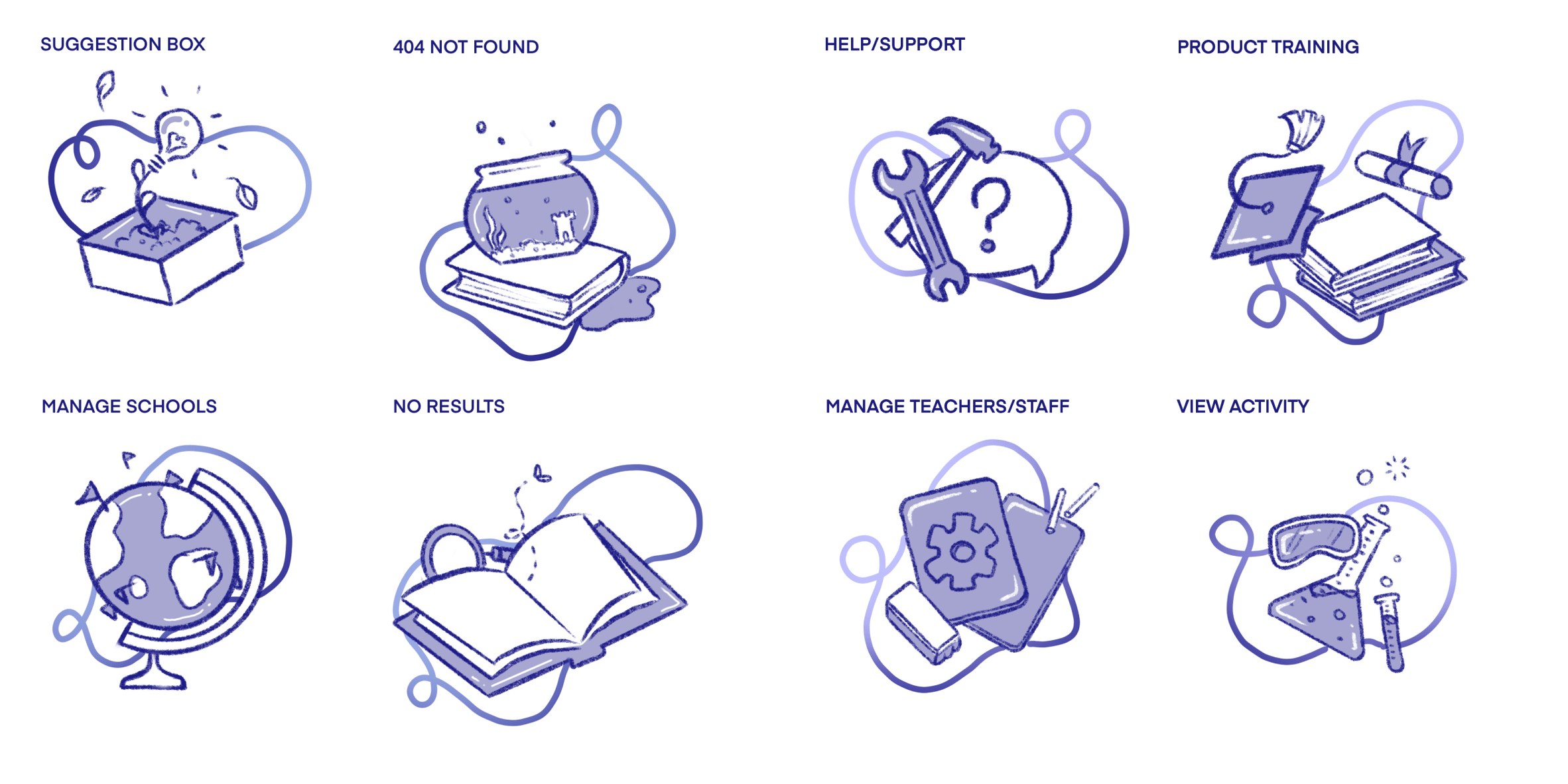
After meeting with the team and proposing 3 different styles based on our exercise, we picked a style we all liked and I began to digitally sketch out a set of empty state illustrations in the new style.
Final Output & Variations
Shown here is part of our illustration set that is currently being used in products like Reading Rangers and LETRS. These were the result of several weeks of research, concepting and feedback with various stakeholders to ensure I was hitting all the brand requirements.

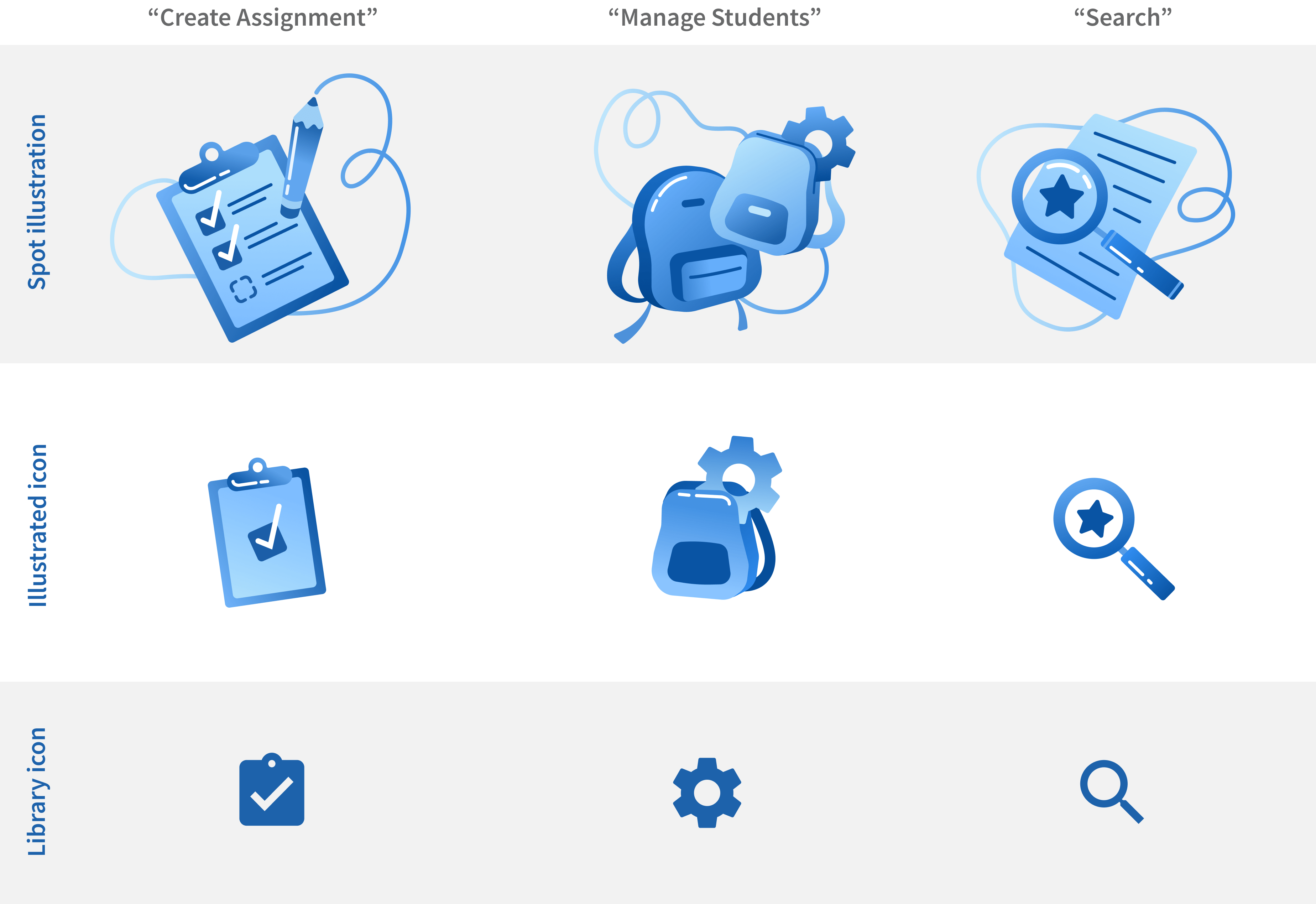
Since empty states are not the only area that illustrations can be used in a product, I built out a system that ensured we had several options for size and complexity, down to our library icons to keep our visual metaphors consistent.
Finally, each illustration was built as a Figma component so our designers could easily place them into design comps and swap out the background circle to ensure the illustrations would appear comfortably on any background.

Cisco Illustration System
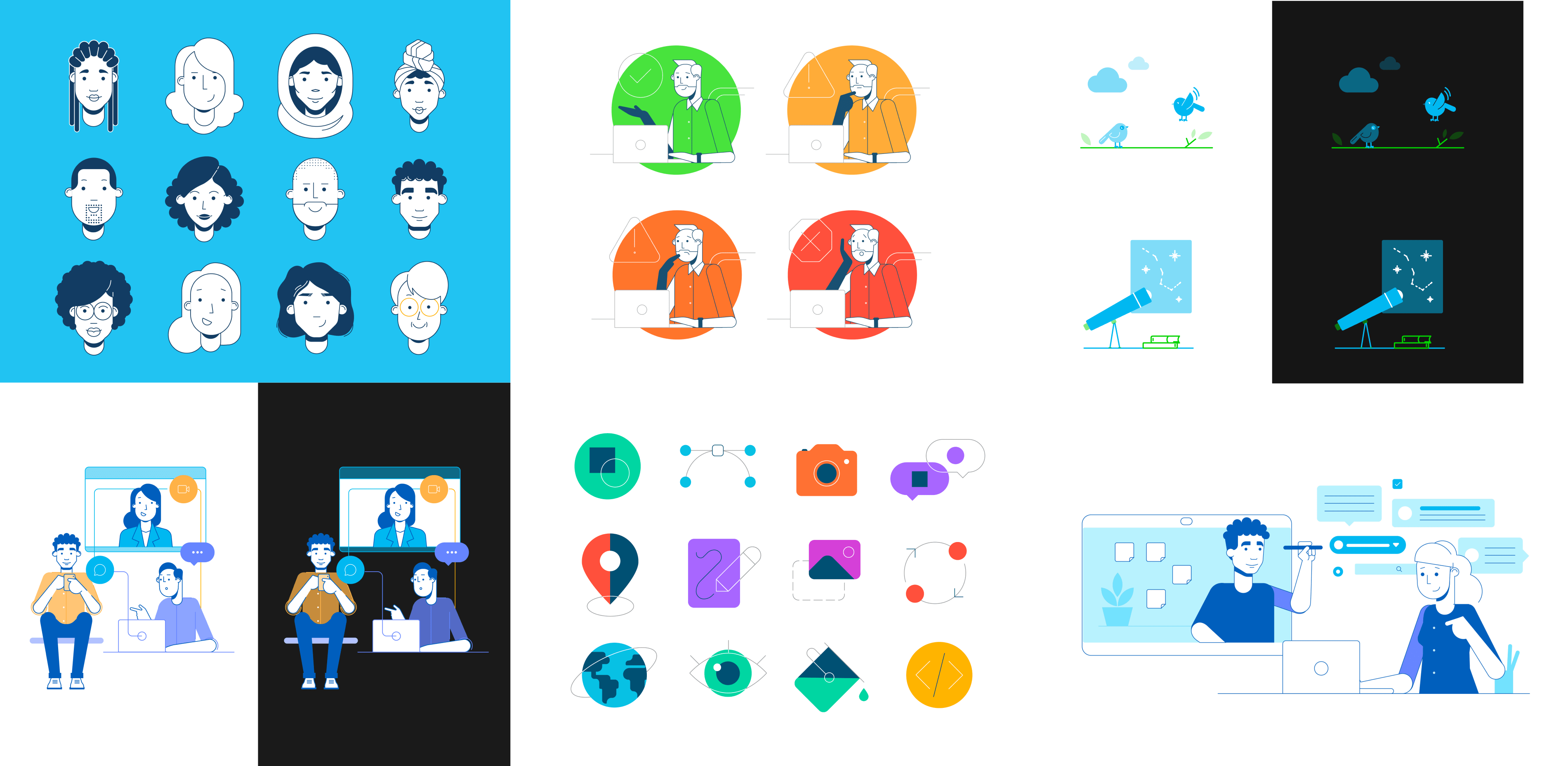
When I arrived at Cisco, they already had an illustration system of sorts. However, it hadn't been documented or regulated, so many of the illustrations had been recycled over and over to the point where they were breaking or losing quality. Above are some of the illustrations I created in my time at Cisco.
Creating a Brand Voice
After proposing a method for updating the illustration system that came with a new governance model which would allow the Momentum Design team to own and document the system, I was given the go-ahead to create a team and update our style. I started out with a brand exercise using our design attributes to outline how we might adjust our style to match our personality.
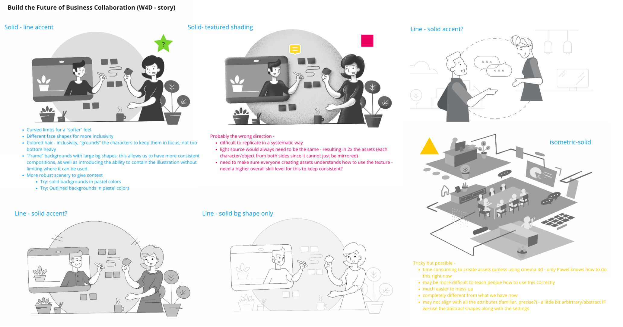
Shown here are some sketches I created early on to demonstrate some of the subtle style changes we could explore.
Sketching Metaphors & Considering Diversity
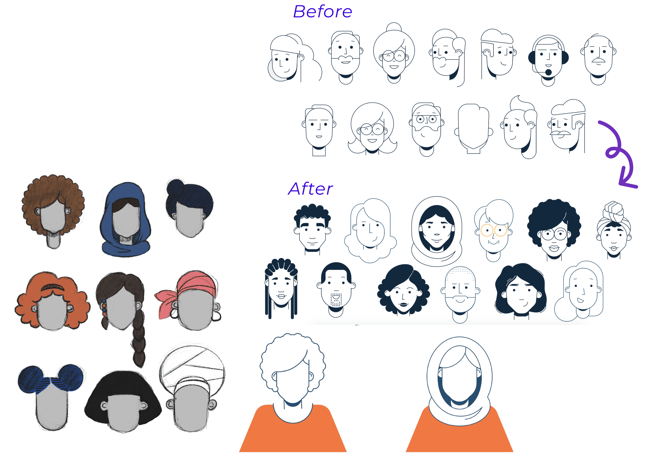
I also took this time to explore ways to bring in diversity to our illustrated characters. Many of our users had noted that the outline style and white product backgrounds made all the characters appear caucasian. After some careful research, I landed on a way to use hairstyles and accessories to imply a more diverse character set.
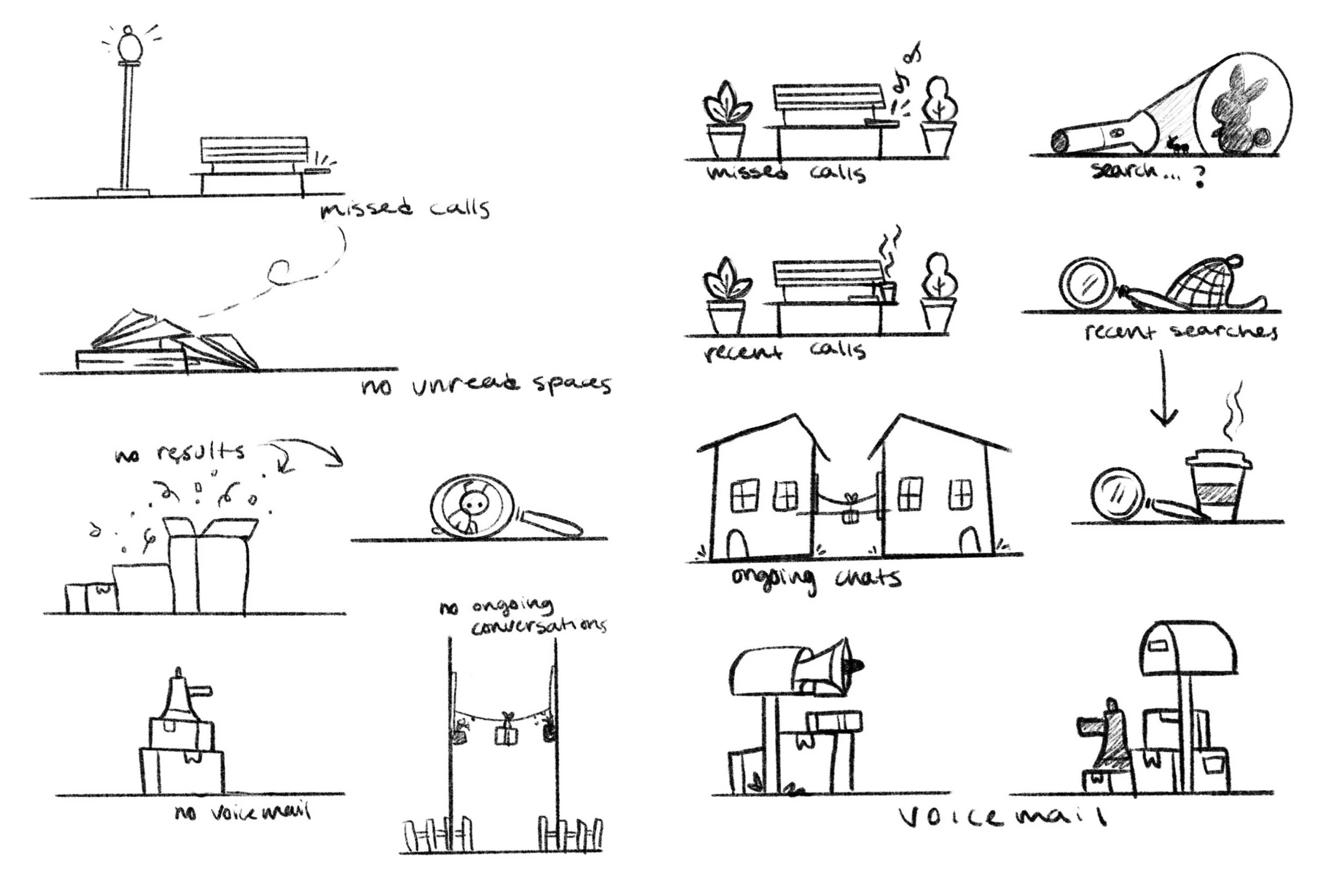
After conversations with our users, our solution for empty state and spot illustrations was to use metaphors to convey a message. The sketches shown are some of my personal explorations.
A Systematic Approach
Beyond creating new sets of illustrations, I was also able to create a method of styling our illustrations that allowed us to use the same assets on white and dark gray backgrounds, which eased the weight on our devs.
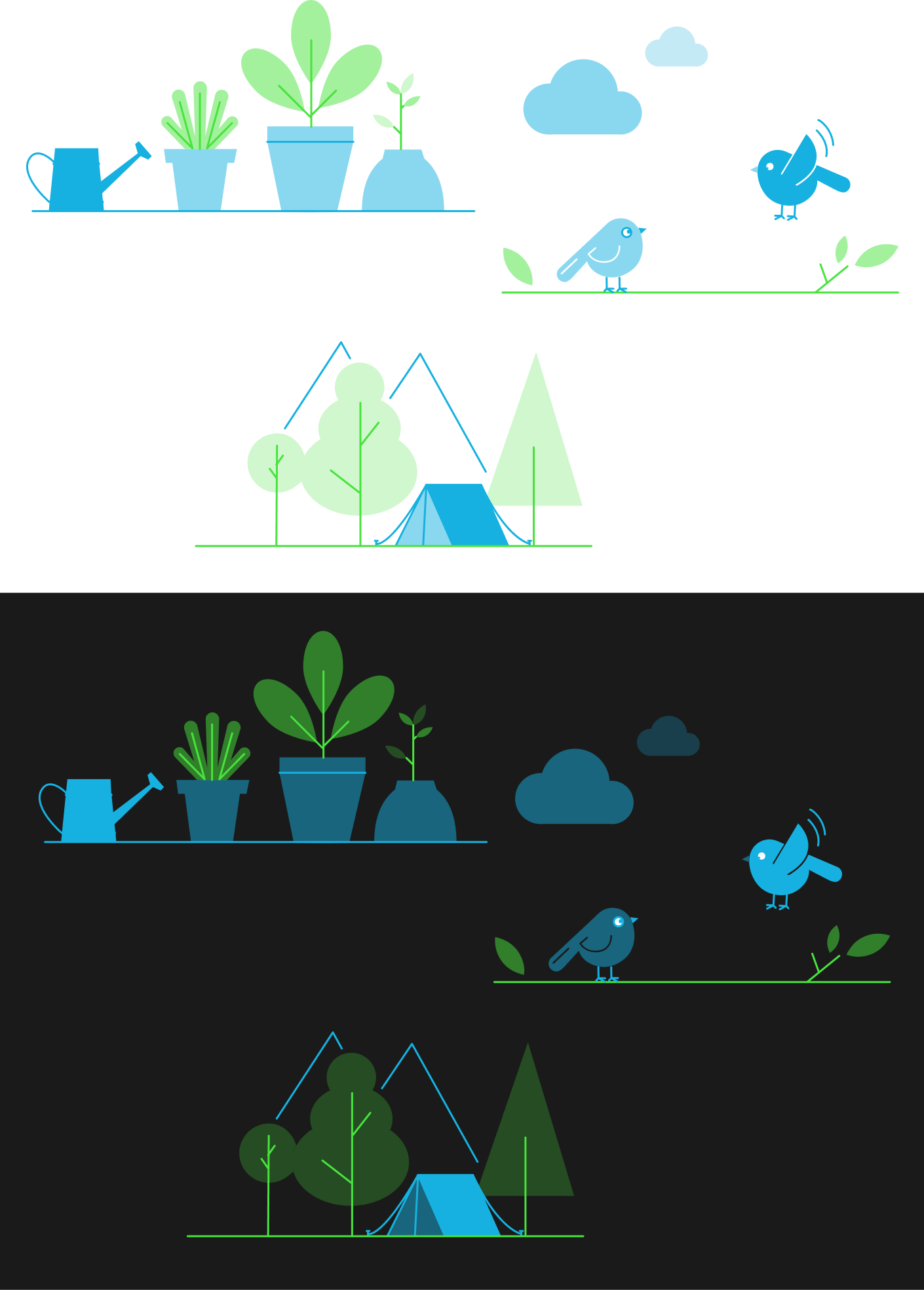
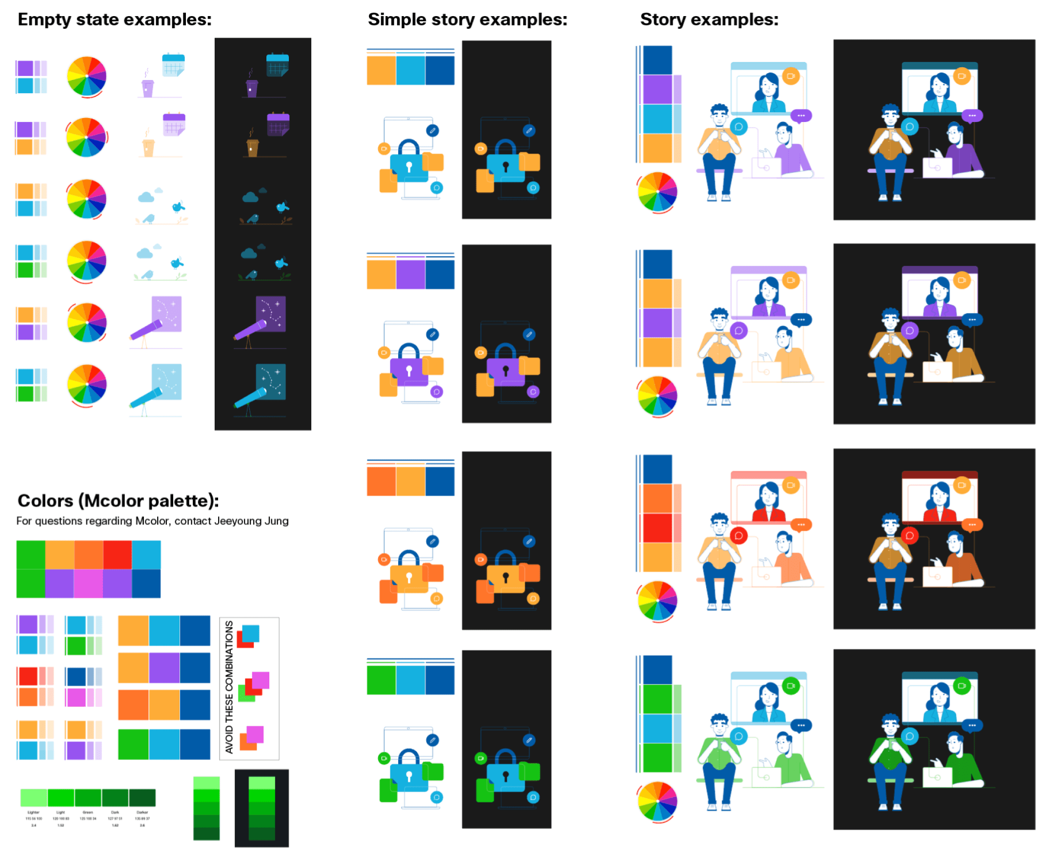
Some examples of color variations and background tests to make sure every possible color palette we might use would work well on light and dark backgrounds.
We wrapped up the project by creating a symbol library for the illustrations so that any designer could create “new” looking illustrations without needing to pick apart older designs.

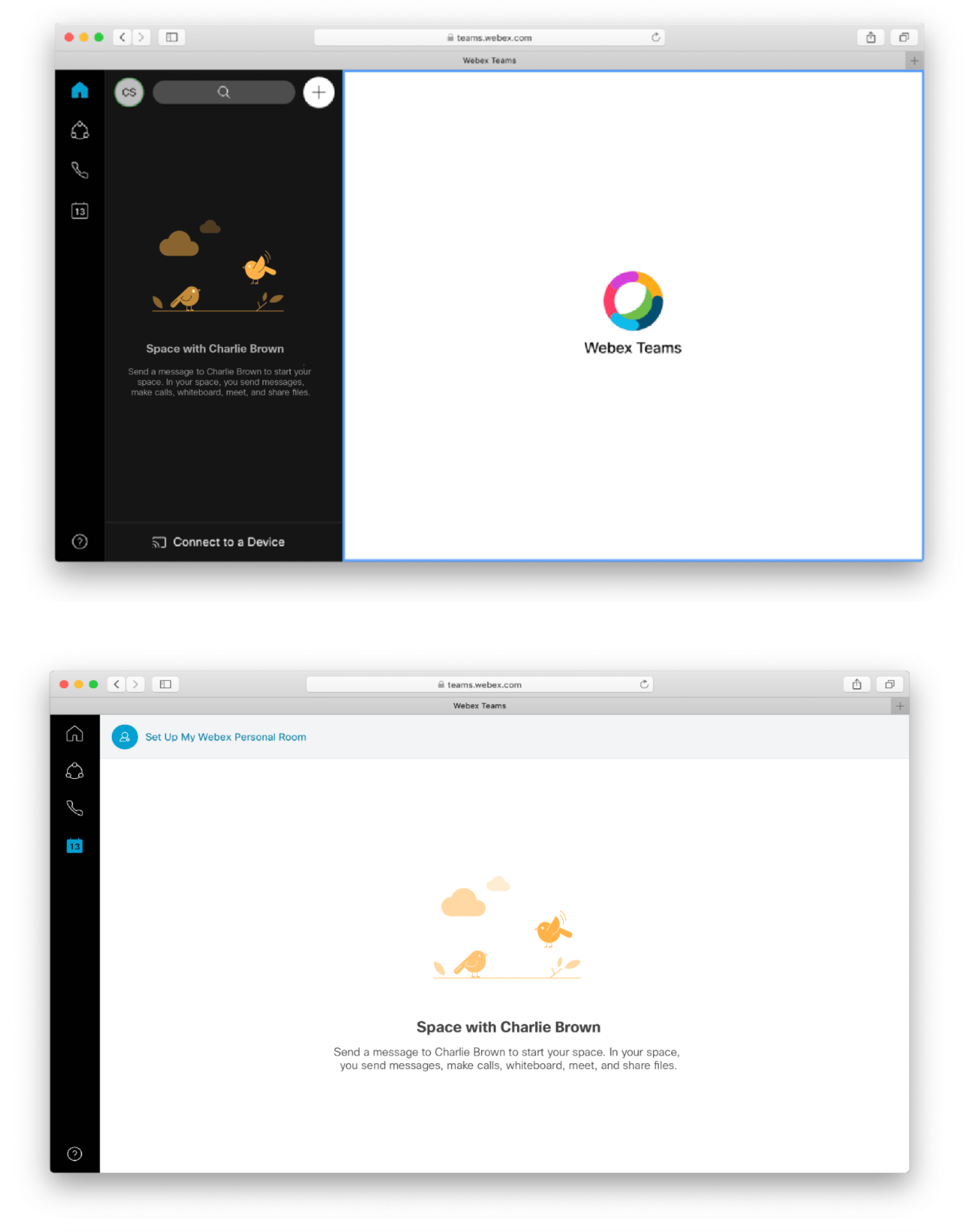
Some examples of how the illustrations would later be implemented into the products. This one is a mockup of how the empty state illustrations would be used in Webex.
Bonus! Webex Reaction Emoji Designs by Yours Truly
I was also lucky enough to be able to design the reactions for the Webex client. These are still being used in product today!

Other Work

Lexia English Conversational AvatarProject Management | UX | Game Design
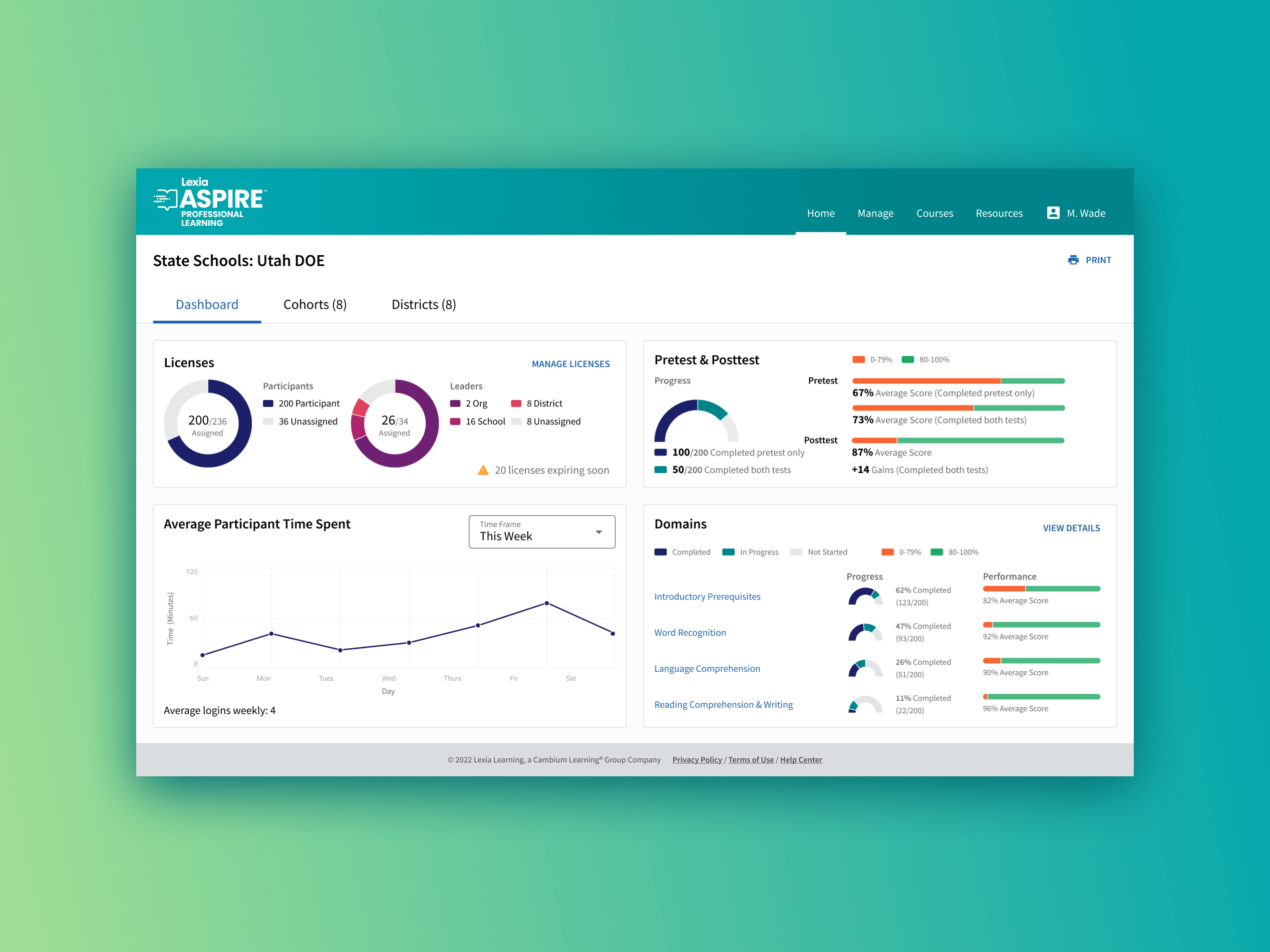
Lexia Aspire Professional LearningUX | Data Viz | Branding
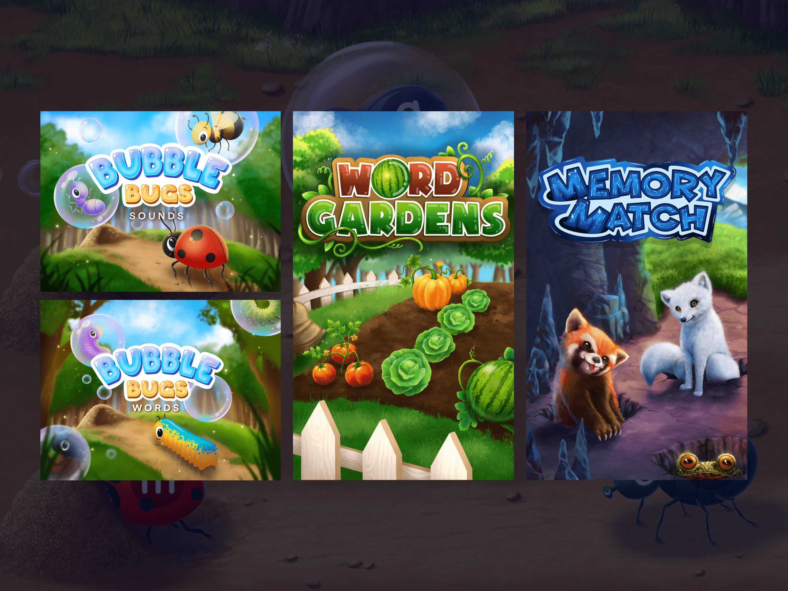
Reading Rangers GamesUX | Art Direction | Game Design
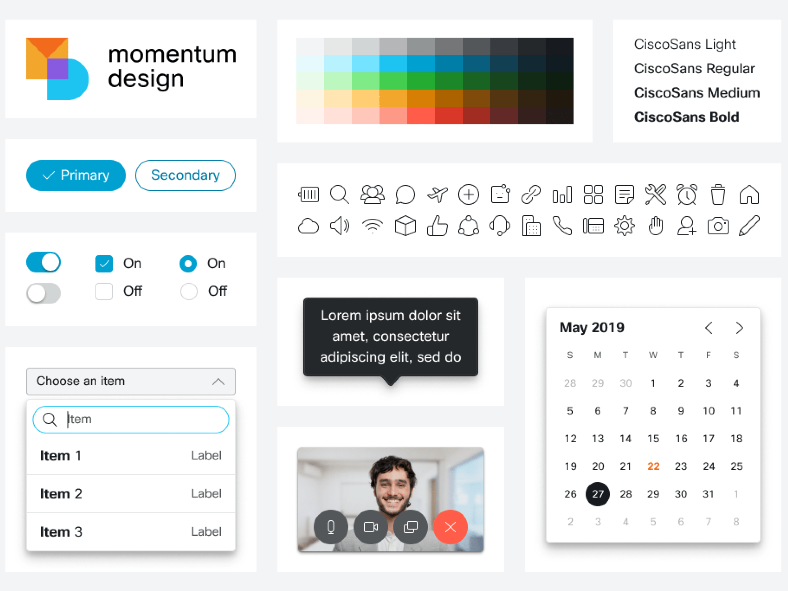
Cisco Webex Design SystemUX | Design Systems | Visual

Illustration System WorkDesign Systems | Project Management | Illustration