Reading Rangers
Reading Rangers is a learning program for K-5 students who need a little help learning to read. The main story follows the user through various biomes while they complete a series of learning activities in order to rescue a colorful collection of endangered animals from the greedy villain; Buckleboot! My responsibilities on this product ranged from character design and art direction to designing the experiences for all 3 mini games and working on the teacher side of the product.
Skills: Art direction, character design, UX, game design, visual design, illustration

Student Mini Games
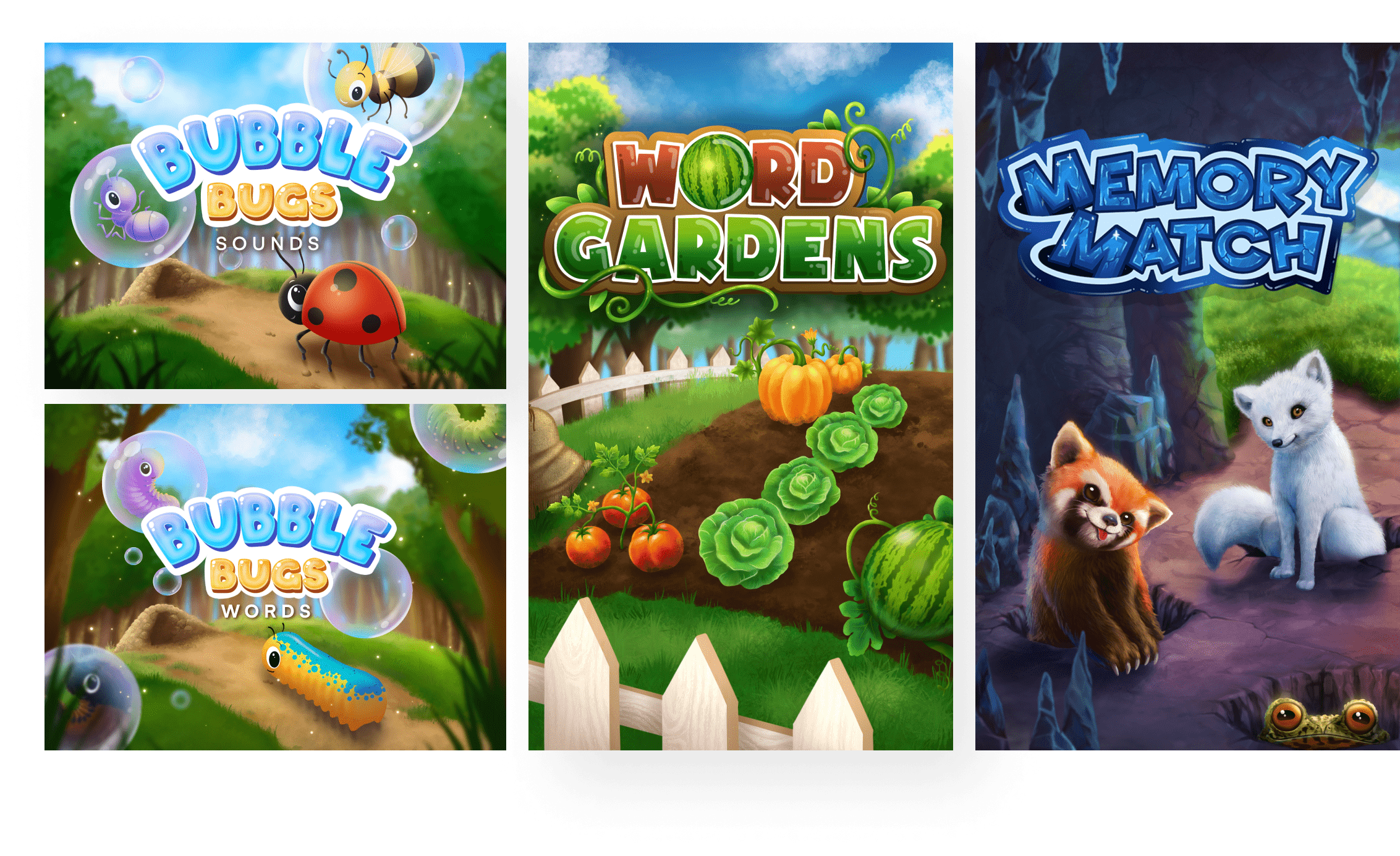
As the students progress through the main story, they are given an option to practice the skills they have been learning. That is where the mini games come in. In addition to designing and rendering all the game logos and splash arts, I was responsible for each game’s UX and visual design.
Creating an Economy
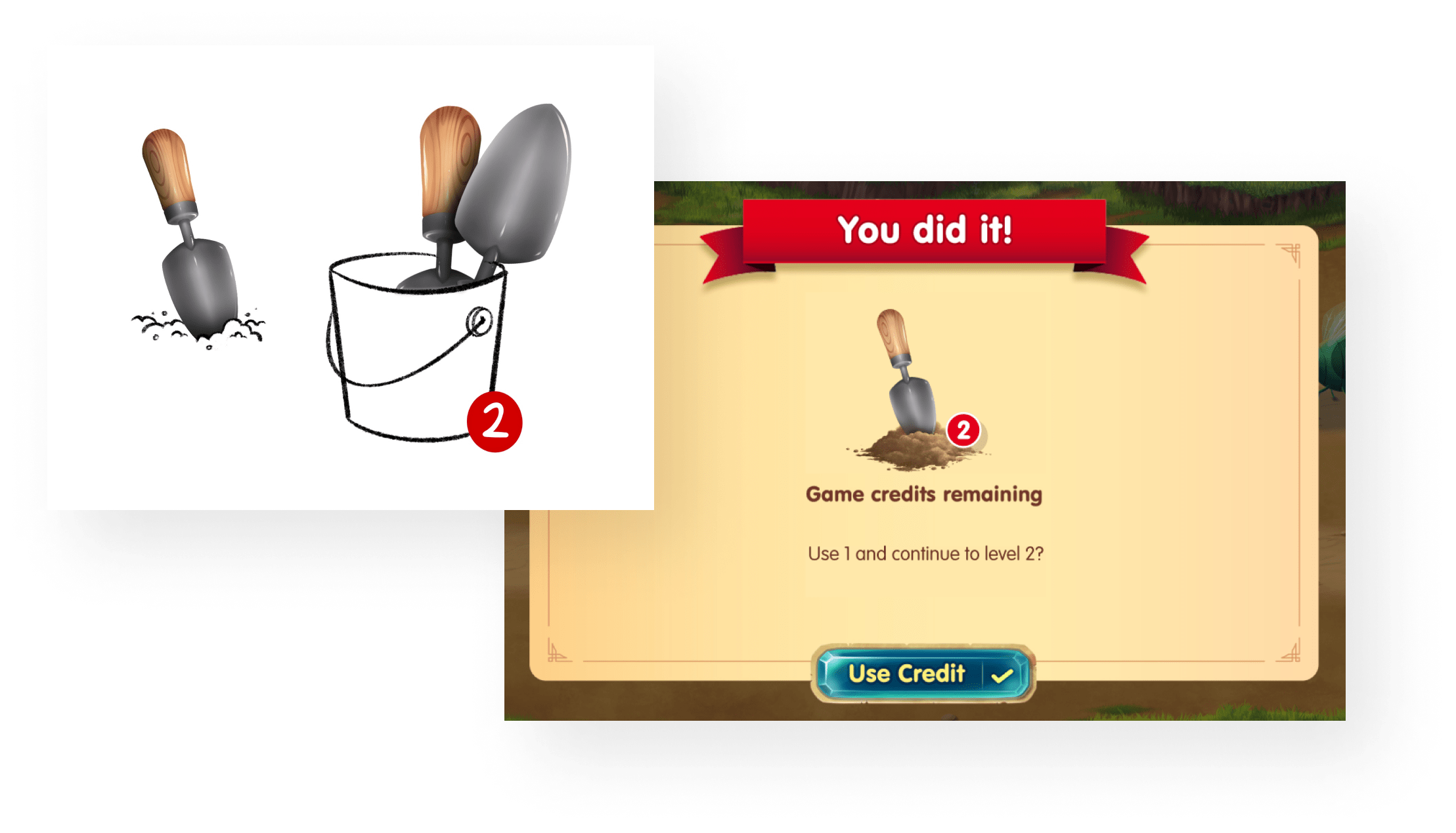
Since the minigames were meant mostly to practice skills that users would be learning in the main quests, the play time needed to be limited. The solution I worked to implement was an “economy” of sorts powered by the currency of “game credits” which could be earned in the main game.
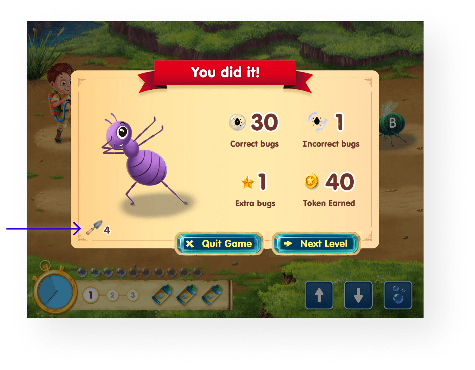
Shown here is an example of what the user will see at the end of a level. Since they will need to consume a "credit" to play another level, the credit count is shown on the bottom left to let them know how many plays are remaining.
Bubble Bugs: Letter Sounds & Word Practice
In the first game I worked on, Bubble Bugs, the user can move between several “lanes” using their bubble blaster to try to capture little bugs carrying letters or words whose sounds can be heard throughout the level.
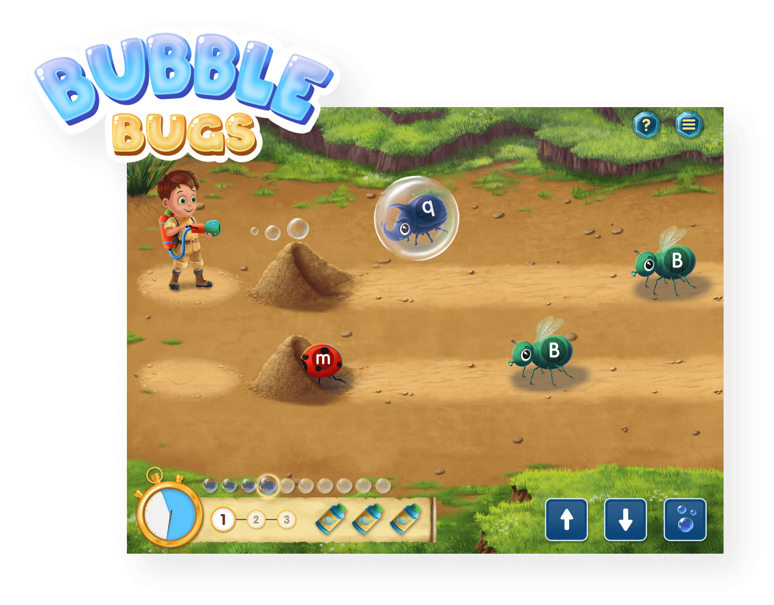
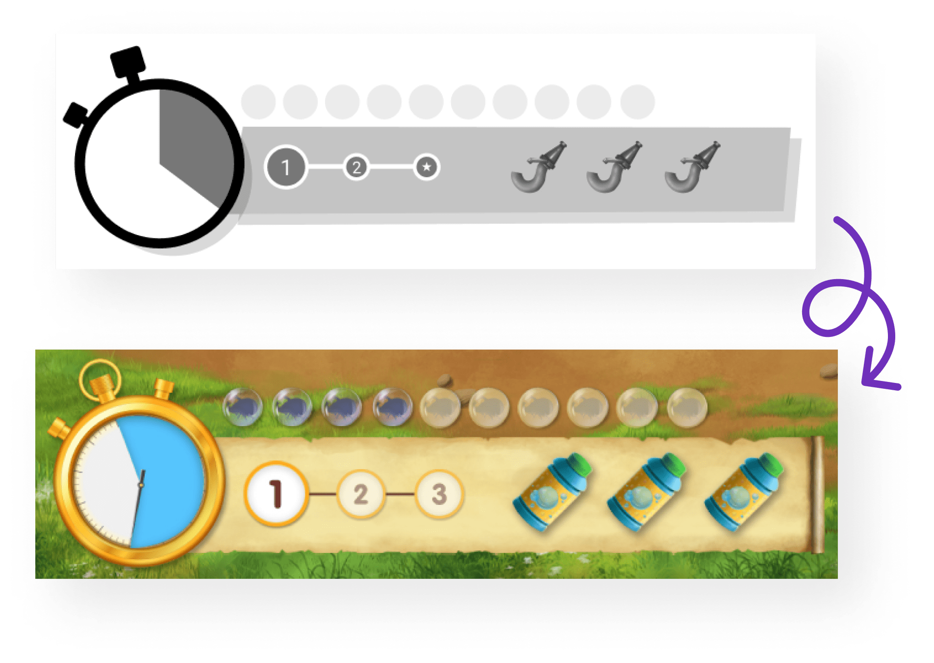
The penalty system implemented in bubble bugs makes sure that the user can’t just spam the bubble button until they “win” the game. Wrong answers matter here too, so they will need to pay close attention to the bugs they catch! If they don't catch the right number of correct bugs before time runs out, they will lose a bubble refill bottle. After 3 failed attempts, they will need another game credit to try again.
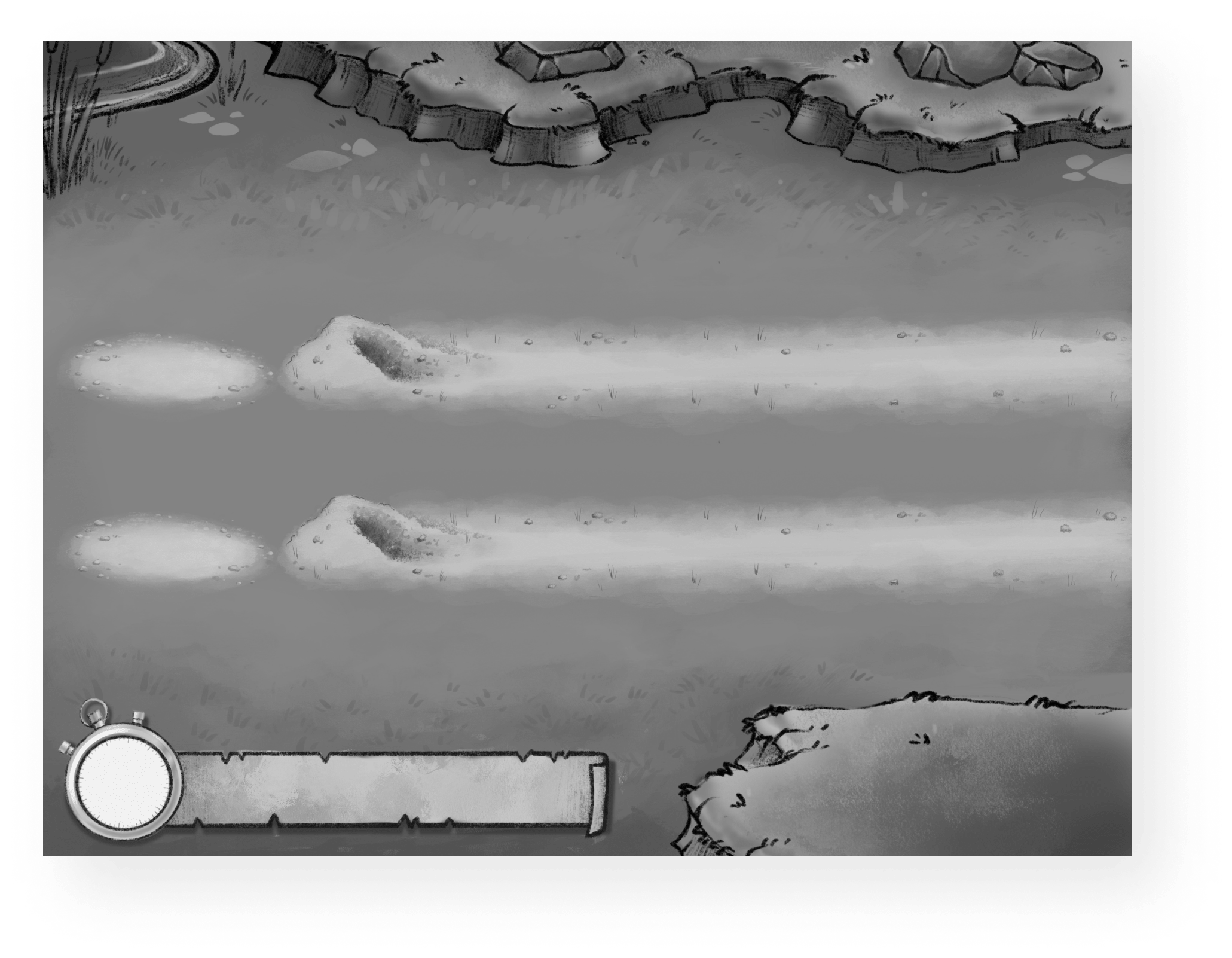
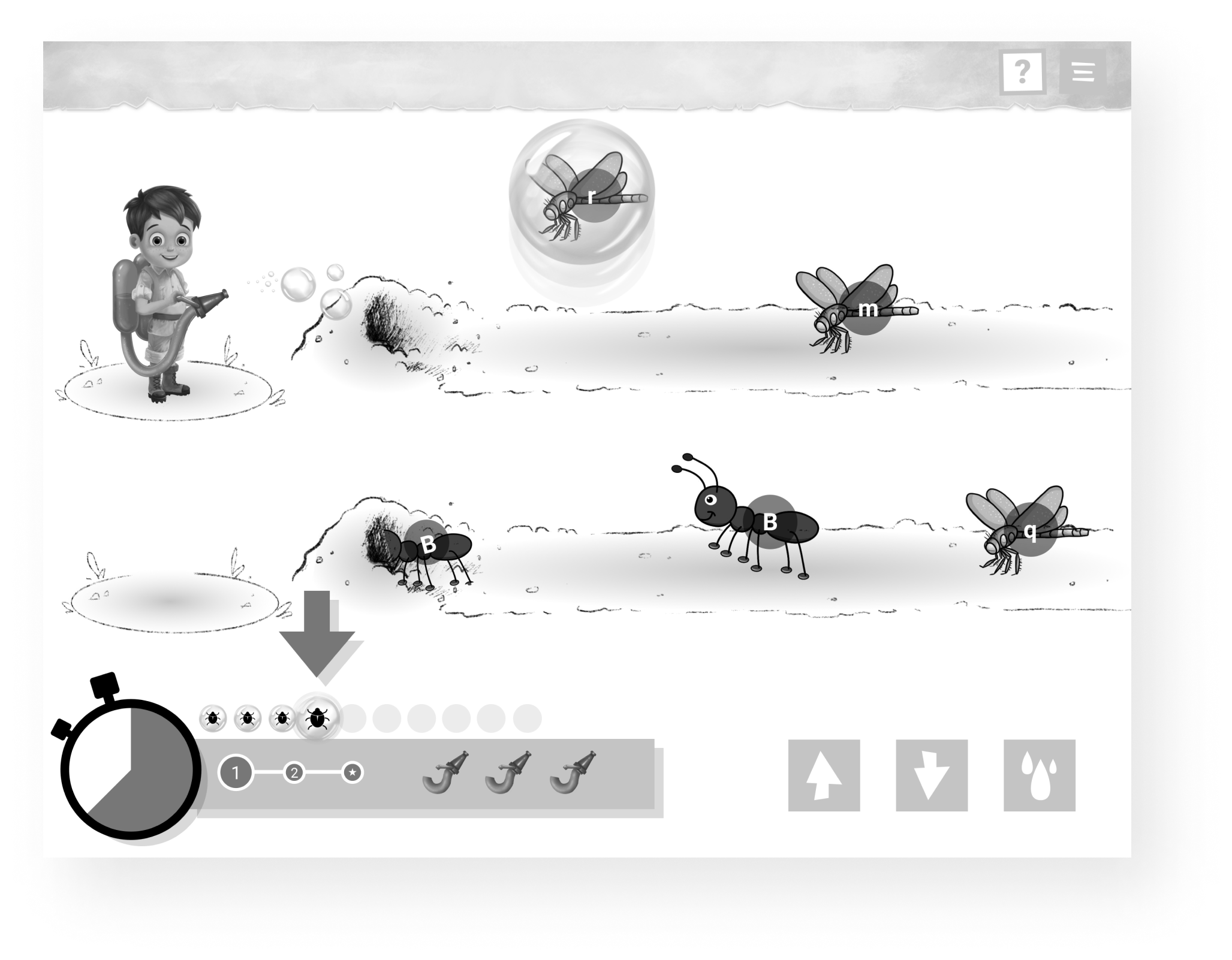
One of the fun challenges for this game was finding a sensible way for the bugs to move across the screen. I came up with the concept of these little "bug dens" that they would disappear into once they passed the threshold of being able to be captured. This made it clearer which bugs the user would be focusing on at once. Above are some of my early designs for the "lanes" that the user could move between.
Word Gardens: Spelling Practice
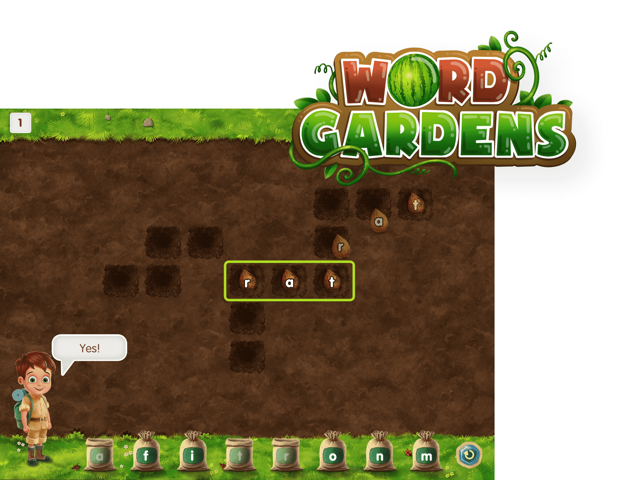
My second minigame was called Word Gardens. This one is a colorful spin on a crossword. Users are prompted to “plant” letter “seeds” that will grow into delicious vegetables for the refuge animals once full words are spelled.
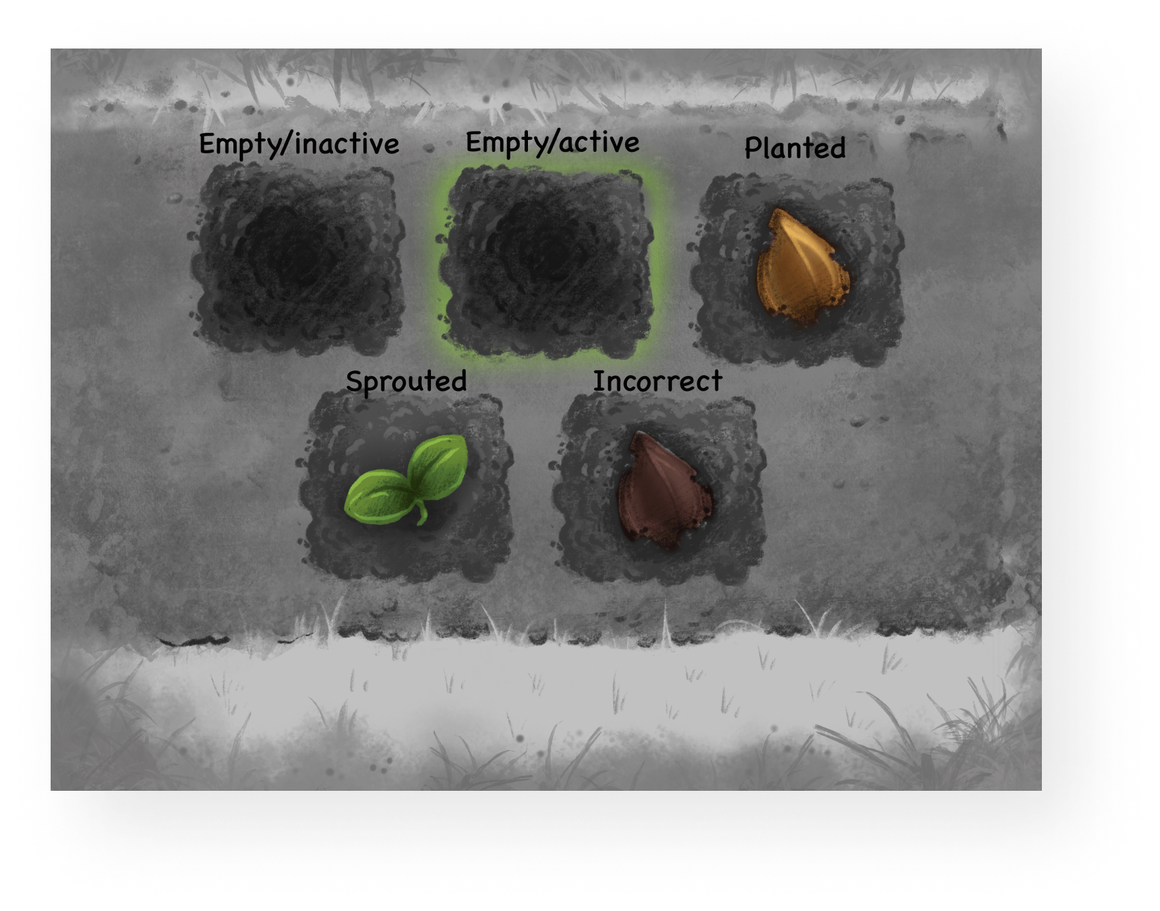
Since I was working with plants in a garden instead of basic letters, I needed to come up with a clever way to show user feeback. Shown here is one of my early sketches indicating what the different states of the "planted" letters might look like.
In order to implement different difficulty levels for this game, grid options were created to allow for puzzles with much longer words. This way, as users progressed through the levels, they would be given more challenging puzzles.

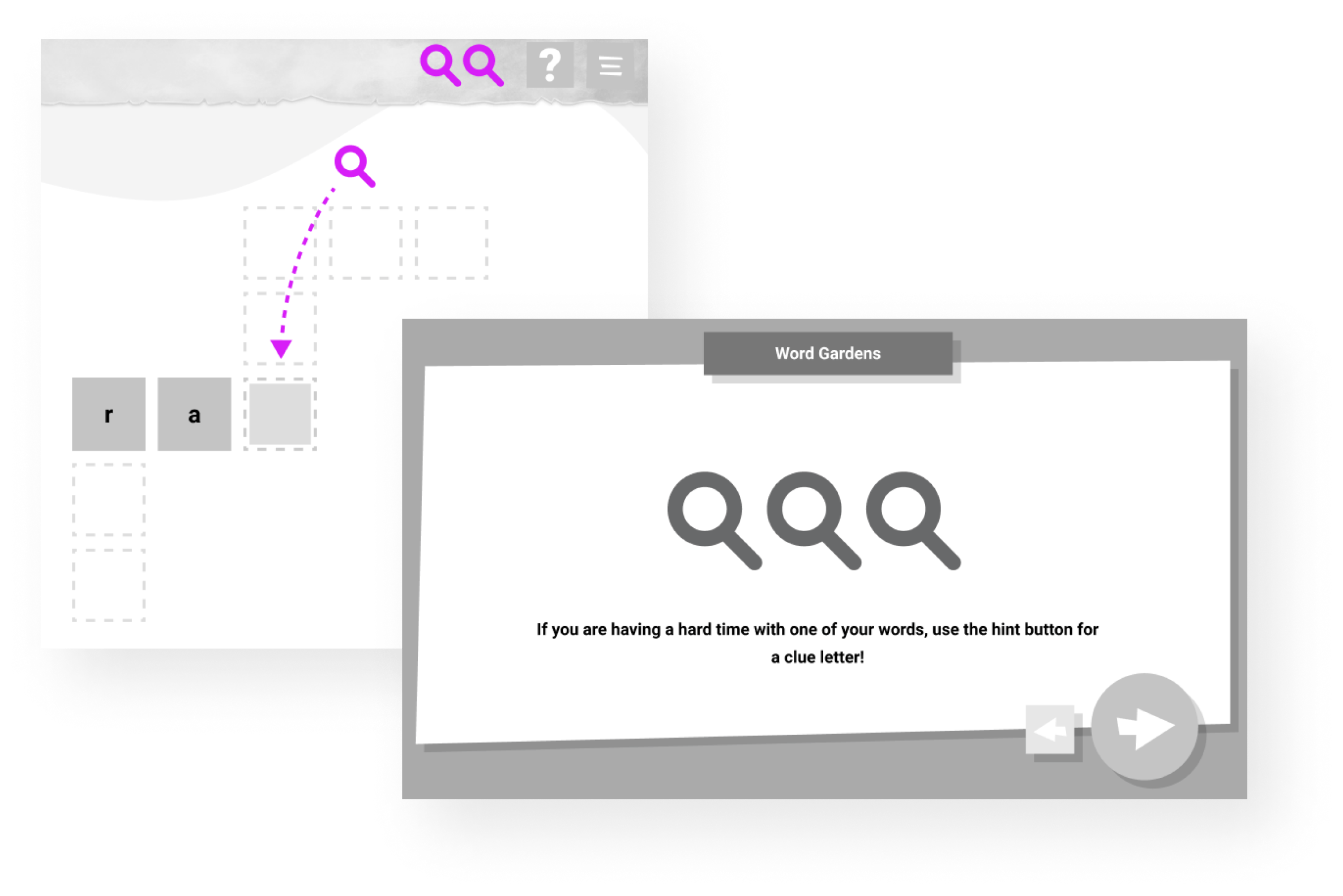
Since this game doesn't offer written prompts to clue the user in to what words should be spelled, it was necessary to implement a "hint" system in case someone gets stumped. Users are offered 3 per puzzle and can use them whenever they would like.
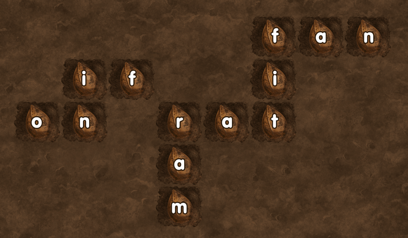
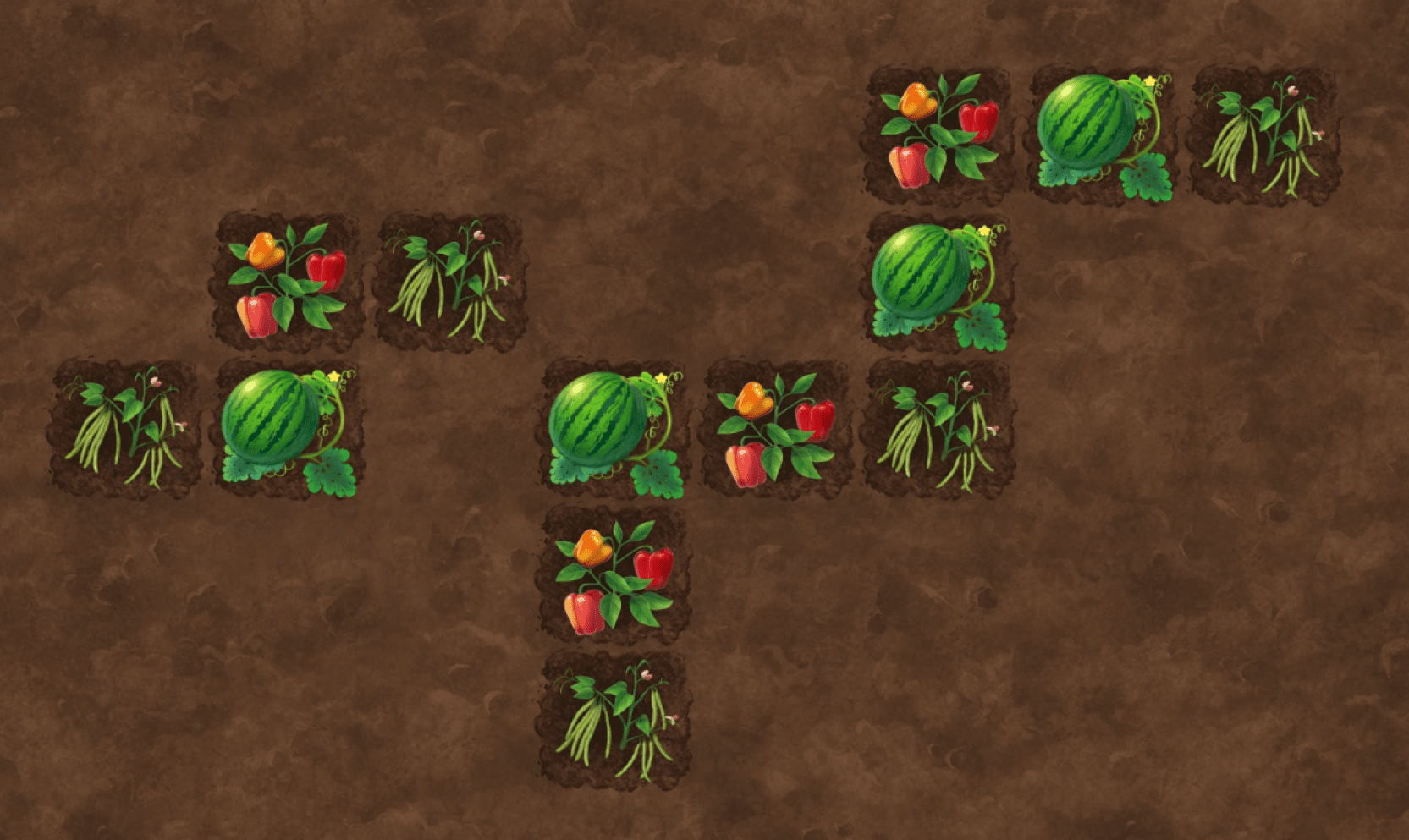
Below is an example of what a finished puzzle may look like. After all the words have been "planted", the level ends with a sweeping animation of all the plants growing into delicious foods.
Memory Match: A Catch-All Matching Game
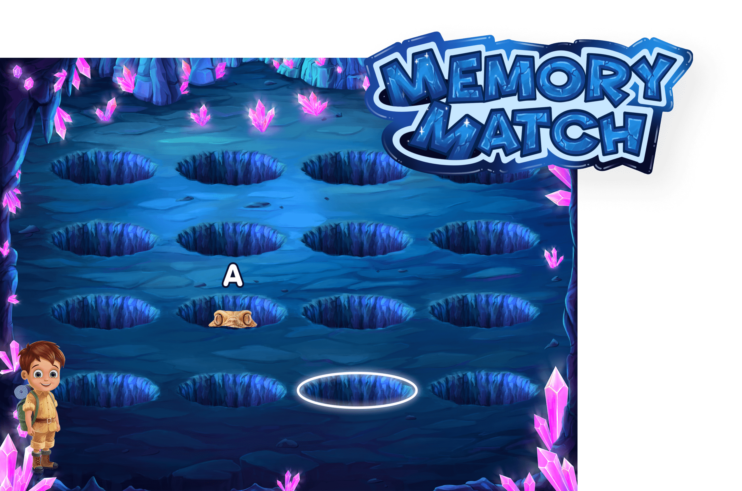
Memory Match was created as a catch-all way for users to practice a wide variety of skills via pairing up animals to send them back to the refuge.
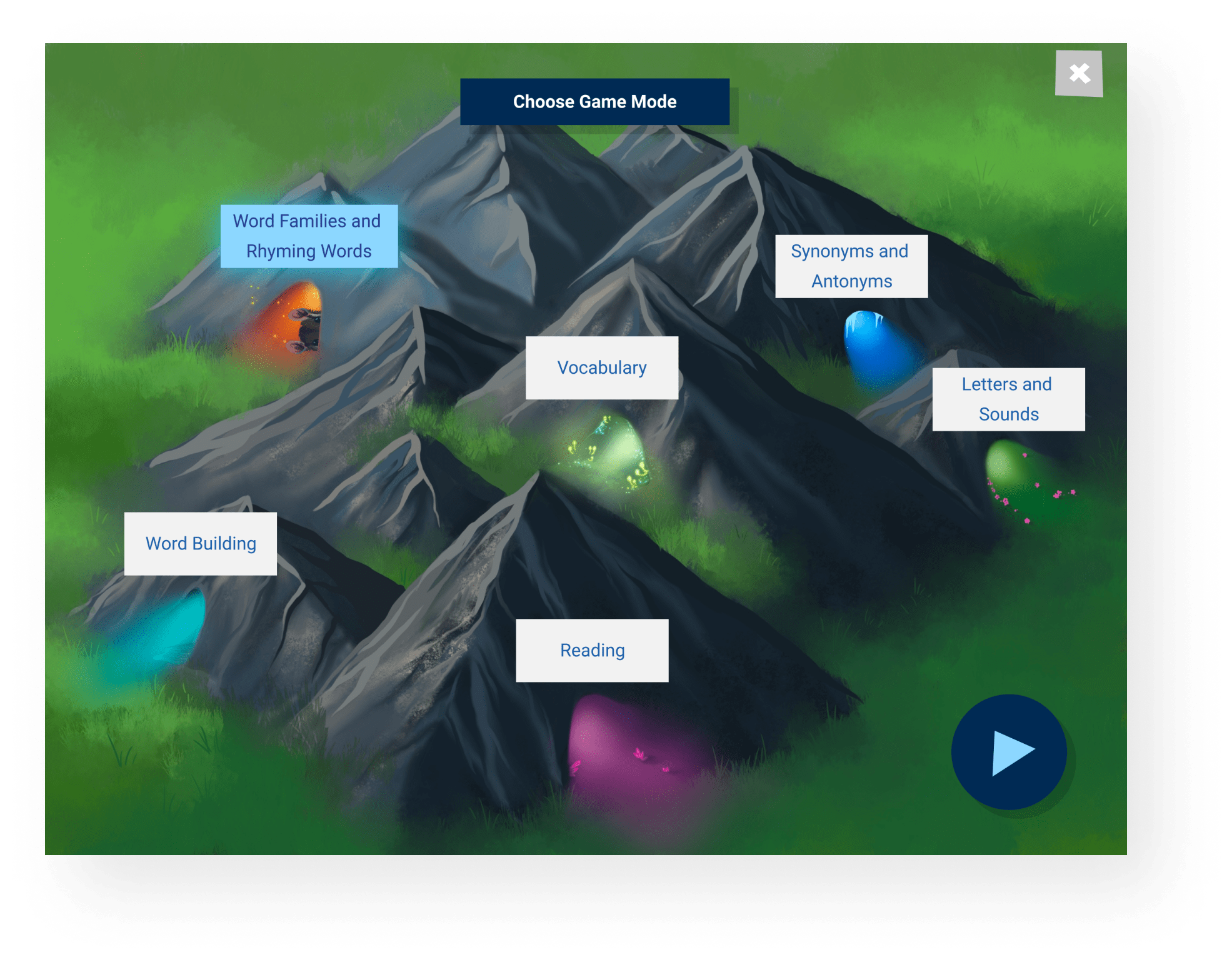
Since there were so many options of skills to practice in this game, I created a selection menu in the form of the different cave types the users could "explore". Shown here is an early illustration I created to show how we could display those options.
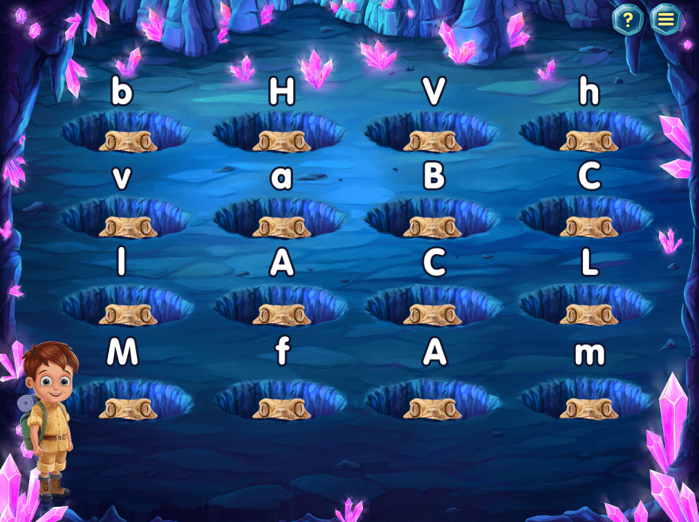
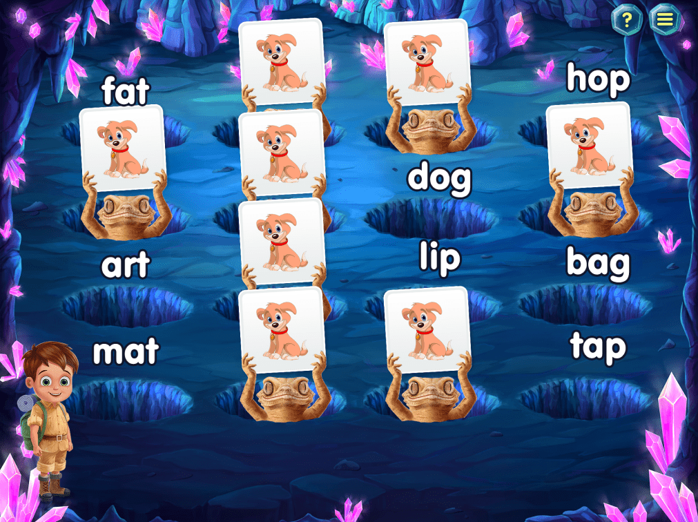
Below are a few examples of some of the content types I had to account for when designing the layouts of the "caves". Activities included matching lowercase and capital letters, words with images, and many others.
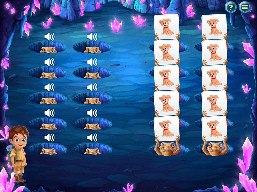
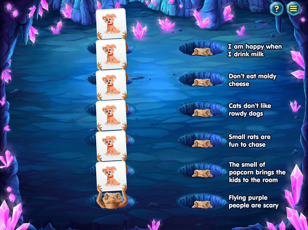
One of my jobs throughout the process of designing all these games was to work with our vendor to create the final assets and animations for each game. Shown here is an example animation I created in AfterEffects to visualize the timing for some of the animal animations in the matching game.
Concept & Art Direction
Since so much of this product is art focused, I spent a portion of each day working with our vendor to imagine how the characters, assets and backgrounds would need to look. Here are some of my concept sketches from the various games.
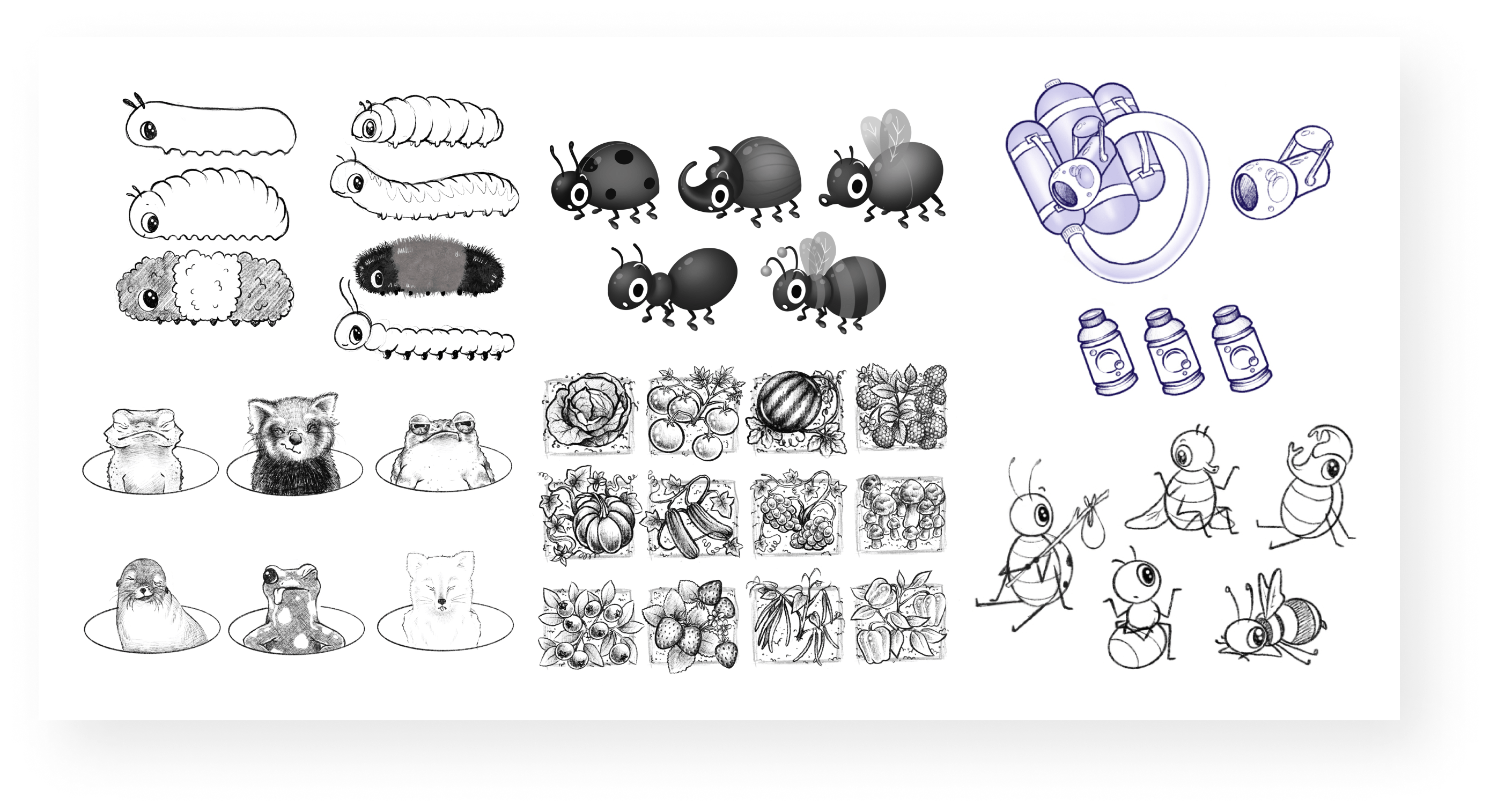
Below are some examples of the visual direction I sent along to describe how to animate the characters that would celebrate when the player finished a level of Bubble Bugs or Word Gardens.
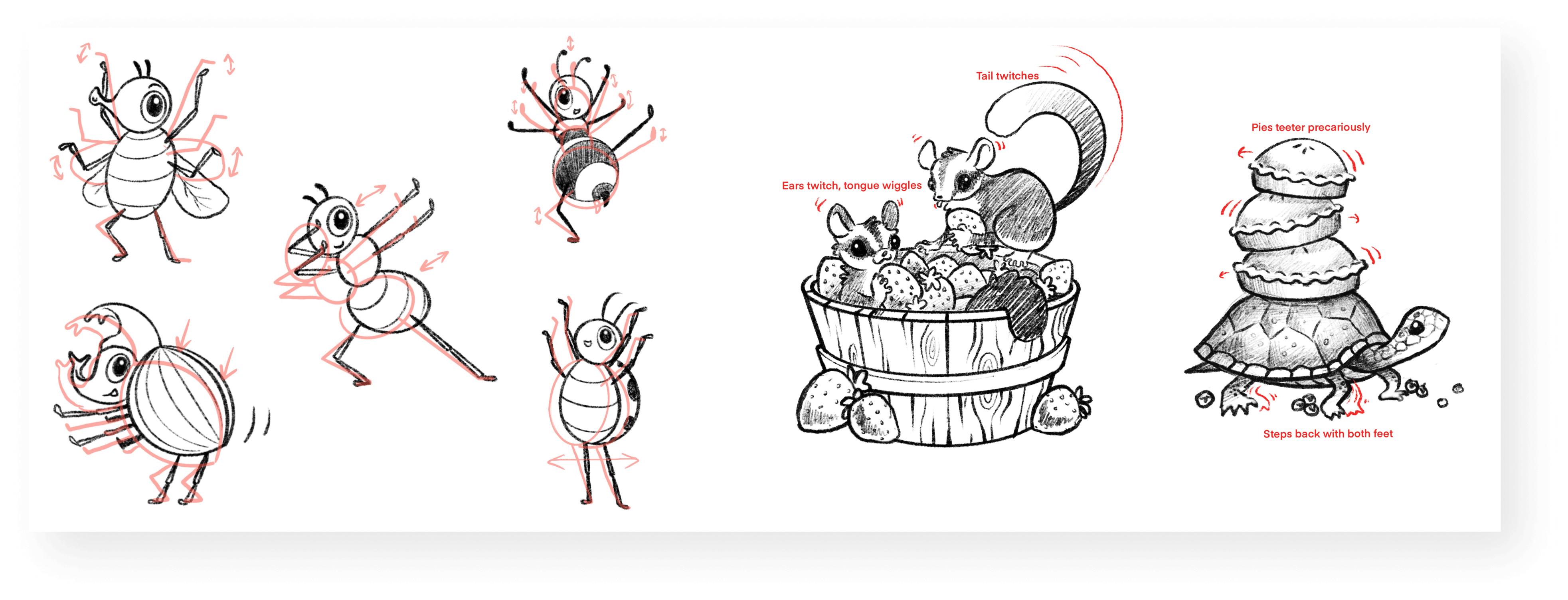
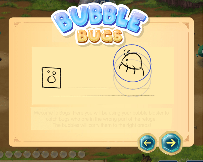
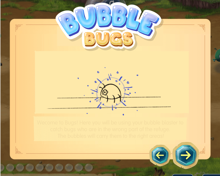
We also had a series of animtions that would be shown to describe how to play each of the games. Below are some examples of my sketches showing how these instructional images should animate.

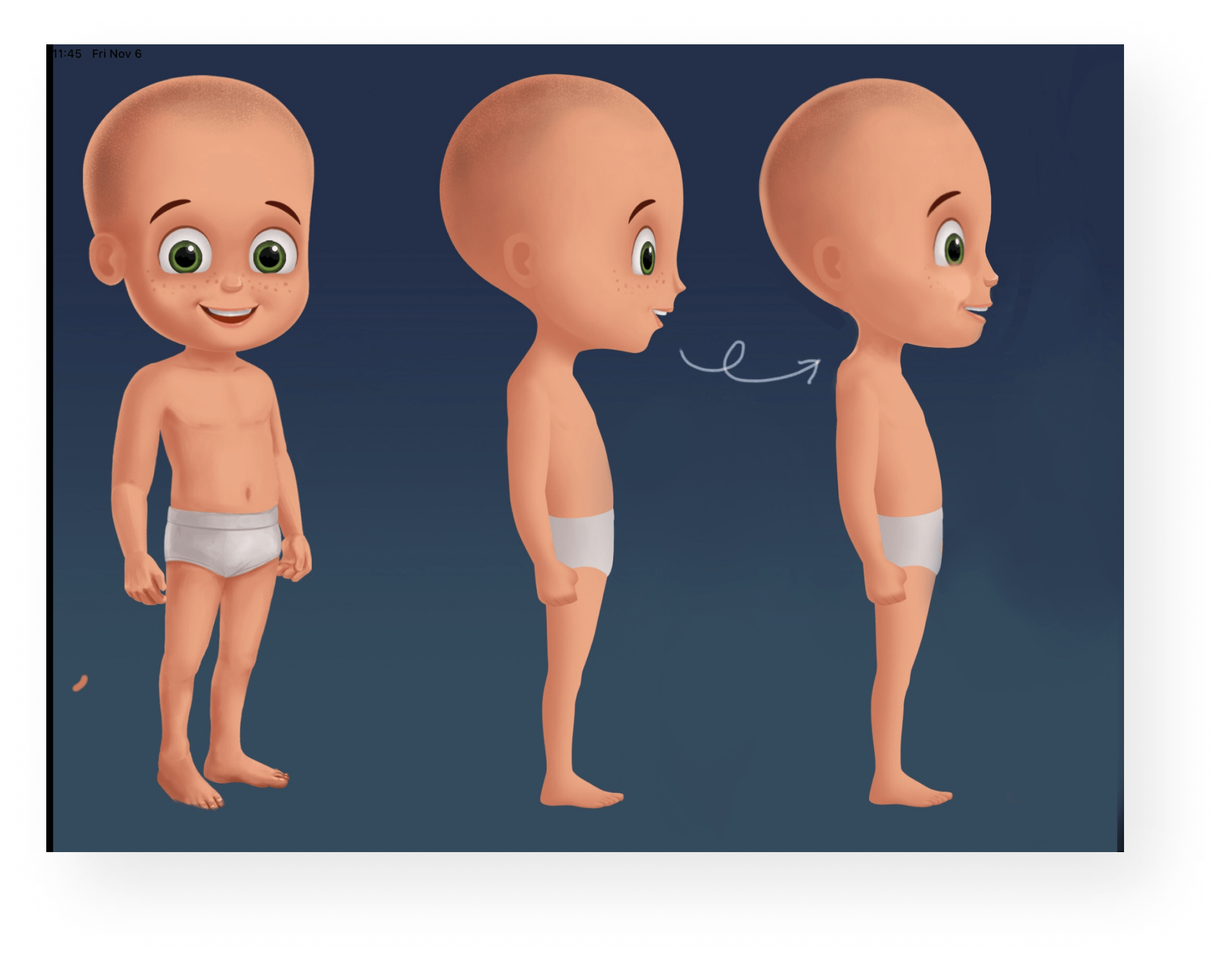
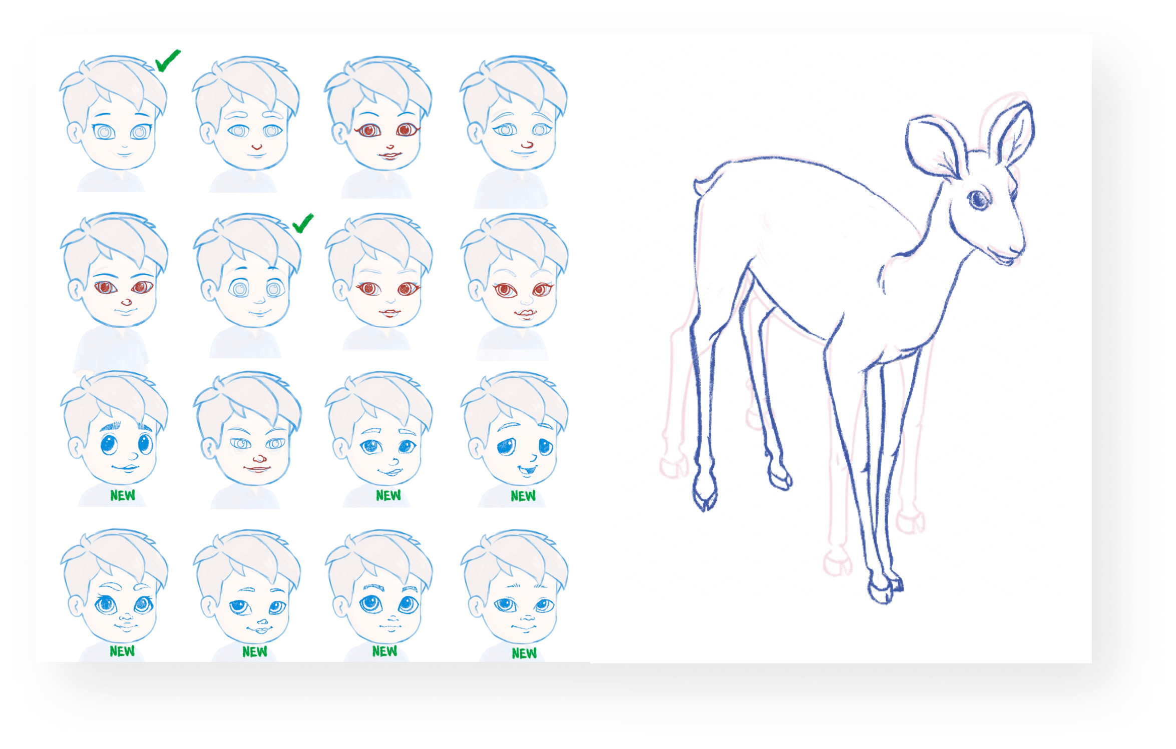
So much love and effort went into every character. I worked tirelessly with our vendor to flesh out the character designs and customization options, as well as many of the animals the players can rescue in the game.
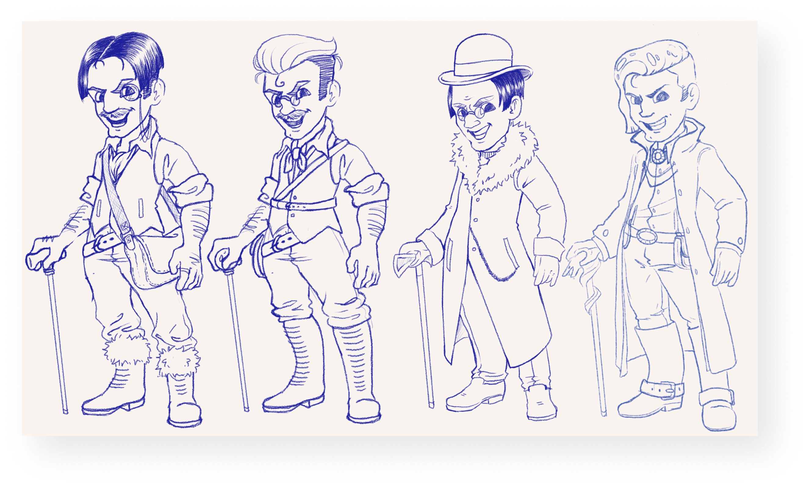
One of the most fun tasks I got to work on was the design for our villain, Buckleboot. Since he embodies the spirit of pollution and deforestation, I wanted to create a character that looked greasy and industrial. These are some early concepts.
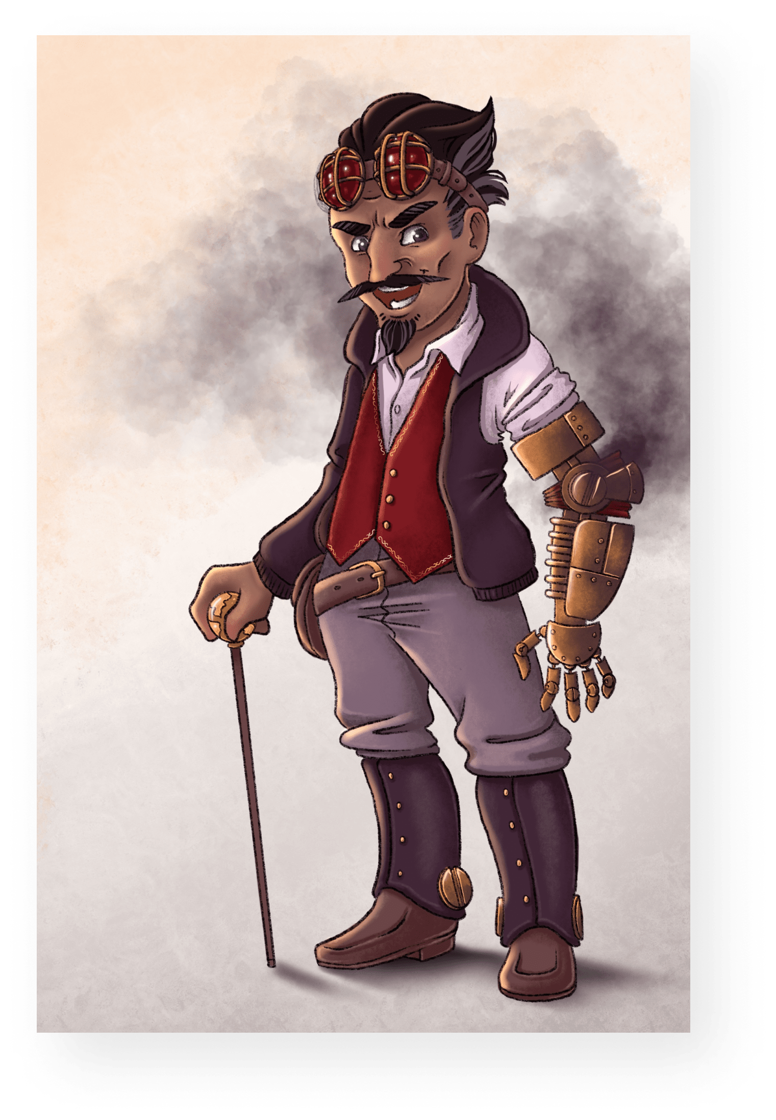
My final villain design leveraged the steampunk style to give off a very mechanical look. Lots of pointy edges and harsh shapes give him a menacing look that our whole team loved.
Other Work

Lexia English Conversational AvatarProject Management | UX | Game Design
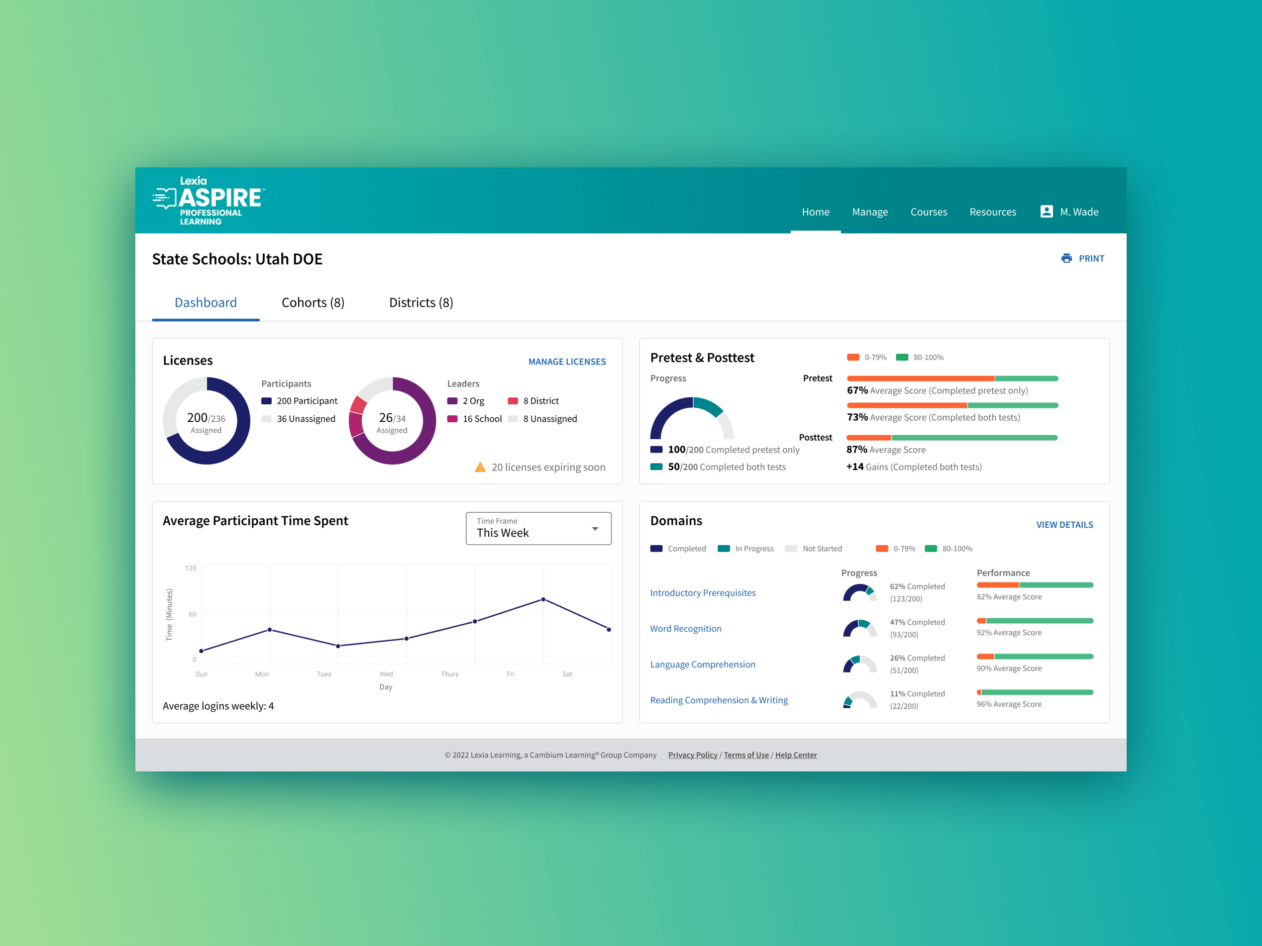
Lexia Aspire Professional LearningUX | Data Viz | Branding
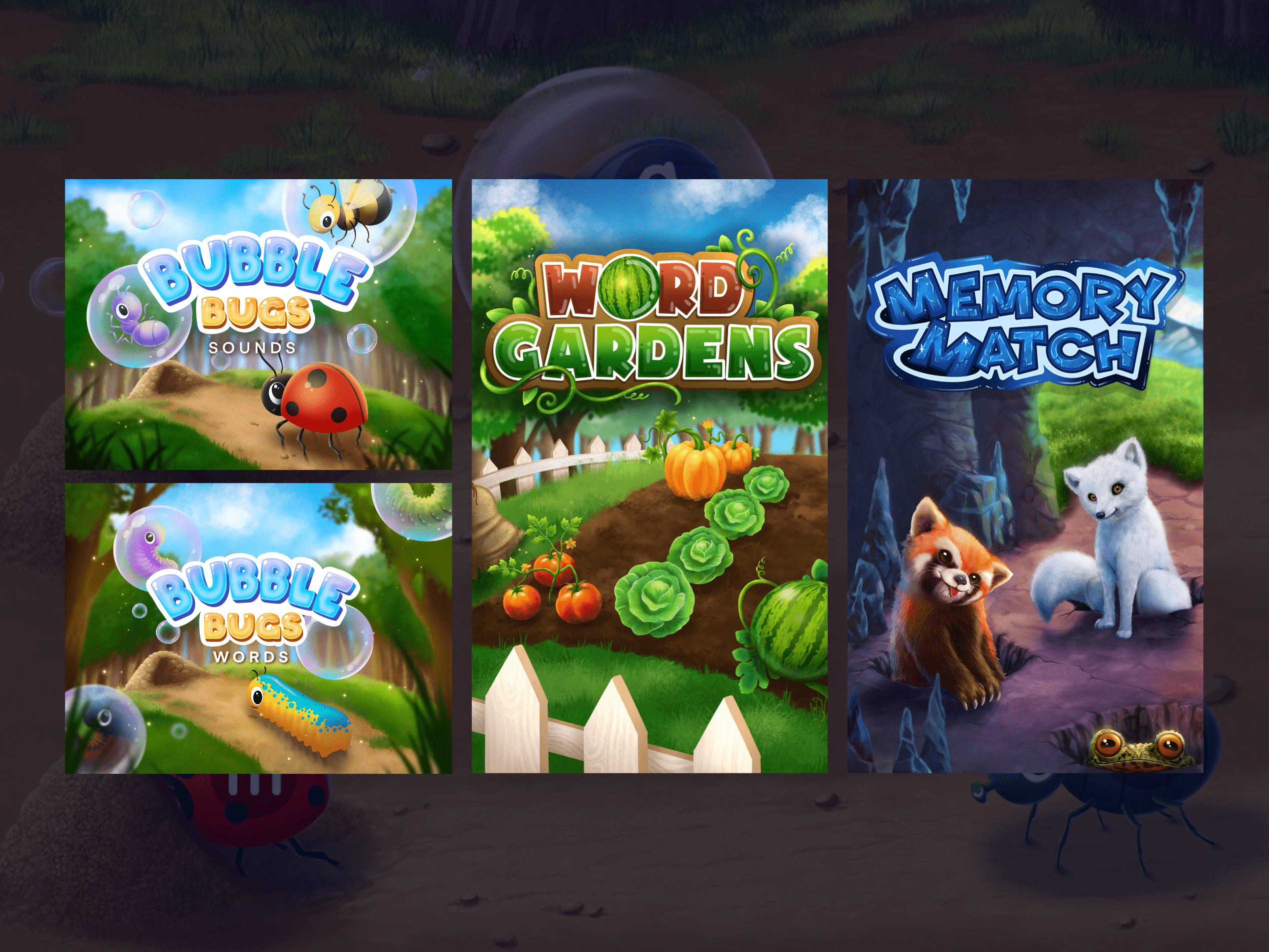
Reading Rangers GamesUX | Art Direction | Game Design
Cisco Webex Design SystemUX | Design Systems | Visual

Illustration System WorkDesign Systems | Project Management | Illustration